
Visual identity creation: how it actually works
Most people think creating a visual identity means showing logo options until one sticks. It's not. See how the real process works, from foundation to delivery.
Neste artigo
- First, understand the business, don't draw
- Then, build the aesthetic universe before the brand
- Only then, the brand
- The complete system, not just the logo
- A presentation with explanation, not a file drop
- Last, files organized for real use
- Why the order matters more than each stage alone
- Perguntas frequentes
Most founders think creating a visual identity works like this: hire a designer, the designer sends three or four logo options, you pick the one you like best. It's the most common process in the market. It's also why so many brands end up looking like the competition, and why so many projects go back for revision without anyone knowing exactly what to adjust.
A well-built process doesn't start with the logo. It starts much earlier, and the logo is practically the last thing that appears.
First, understand the business, don't draw
Before any sketch, the first stage is understanding the business: aligning expectations, mapping the challenge, studying the market, defining positioning. It sounds obvious, but it's the stage most people skip, because it doesn't produce anything visual to show. This is exactly where the project gains real direction. Skipping this stage is the most common cause of rework in the stages that follow.
Then, build the aesthetic universe before the brand
With the strategy defined, the next step is building the project's aesthetic universe: mood board, market references, analysis of the competition's strengths and weaknesses. This becomes the decision base for color, shape, and style, things that change from project to project. Without this stage, visual direction turns into the designer's guesswork, or worse, the client's personal taste. With it, visual direction is a decision, with a documented reason behind it.
Only then, the brand
Symbol, typography, color, and concept. These four pillars only come into play after the foundation and aesthetics are already defined. That's why a well-built logo is never the first thing done in a visual identity project: it's the consequence of everything that came before, not the starting point.
The complete system, not just the logo
Material gratuito
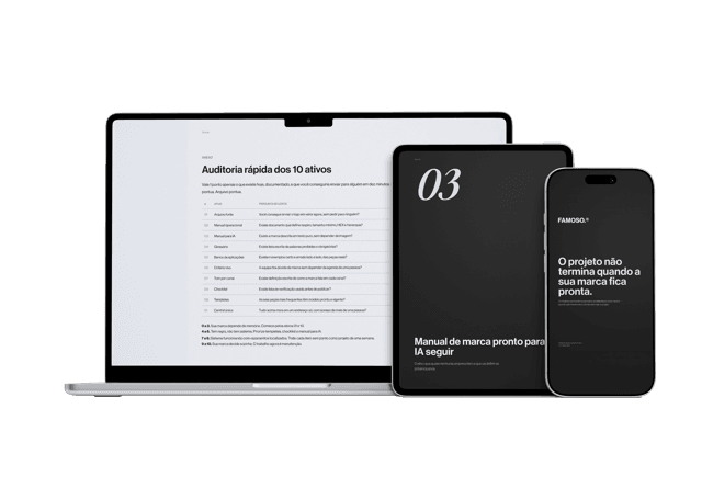
E se a pessoa que criou sua marca sumisse amanhã?
Os 10 ativos que garantem que sua marca continue consistente, com ou sem quem a desenvolveu.
After the brand is approved, comes the longest stage: supporting visual elements, structure, composition, graphic patterns, tone of voice, real application on the website, sales proposal, social media. This is where the brand stops being an isolated logo and becomes a system, ready to work at every touchpoint of the business.
A presentation with explanation, not a file drop
The entire development is presented in a dedicated call, not sent by email with a "see attached". The client understands every decision before receiving the final result. This changes the whole experience: instead of approving a taste, the client confirms a line of reasoning they've followed step by step.
Last, files organized for real use
Identity approved, files organized and delivered ready for market application from day one. No confusing folder, no depending on the designer every time the brand needs to be used somewhere new.
Why the order matters more than each stage alone
None of these stages alone guarantees a good result. What guarantees it is the order: strategy before aesthetics, aesthetics before brand, brand before system. When someone jumps straight to the logo, the result might even look pretty, but it lacks foundation, and without foundation the brand can't sustain a pricing decision or a market positioning.
Perguntas frequentes
How does a real visual identity creation process work?
It starts by understanding the business and defining positioning, then builds the aesthetic universe with a mood board and competitive analysis, only then creates the logo, and finally assembles the complete application system.
Is creating a visual identity just the designer showing logo options?
No, that's the most common process in the market, but it's also why so many brands end up looking like the competition. A well-built process starts long before the logo.
Why does the order of the stages matter more than each stage alone?
Because when someone jumps straight to the logo, the result might even look pretty, but it lacks foundation, and without foundation the brand can't sustain a pricing decision or positioning.
How is the visual identity delivered at the end of the process?
In a dedicated call, where every decision is explained, with files organized and ready for real application from day one.
Material gratuito
E se a pessoa que criou sua marca sumisse amanhã?
Os 10 ativos que garantem que sua marca continue consistente, com ou sem quem a desenvolveu.
Ferramenta gratuita
Diagnóstico de marca
Responda o scorecard e receba o score da sua marca com uma leitura direta do resultado.
Fazer diagnóstico →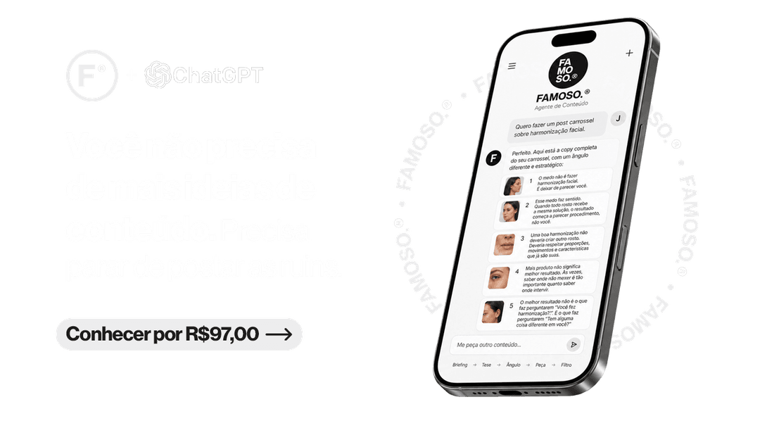
R$97
Agente FAMOSO.®
O processo que uso pra criar posts com tese, não conteúdo genérico. Acesso permanente.
Conhecer o agente →Leia também
- What is visual identity, really?Visual identity is what makes your brand perceived a specific way before a word is said. Most companies treat it as just the logo.
- The difference between logo, visual identity, and brandingThree concepts the market uses as synonyms. The confusion that makes companies spend and still have the same problem. Understand all three at once.
- What Is a Brand Diagnosis and When to Do OneA brand diagnosis is the analysis that shows why a brand looks smaller than the business. Understand what it is, how it works, and when it's worth doing.
Escrito por Pedro Cardoso, fundador do FAMOSO.®, estúdio de branding em Porto Alegre.
← Ver todos os artigosDiagnóstico FAMOSO.®
Você não vende o que faz. Vende o que parece que faz.
Análise completa da sua marca mais uma call de 30 minutos. O valor vira crédito integral no projeto.
CONHECER O DIAGNÓSTICO