
What is visual identity, really?
Visual identity is what makes your brand perceived a specific way before a word is said. Most companies treat it as just the logo.
Neste artigo

Most companies think visual identity is a logo.
They order a logo. Receive a logo. Think they've resolved visual identity.
They haven't. They created an isolated element without a system.
What visual identity really is
Visual identity is the set of visual elements that make a brand recognized and perceived in a specific way.
A logo is one of these elements. It's the most visible. But alone it doesn't make an identity.
Visual identity is the complete system: logo, color palette, typography, shapes, textures, patterns, photographic language, visual tone, grid, composition. All these elements working together, consistently, on any surface where the brand appears.
When this system exists and is coherent, the brand is recognized even before the logo appears. When it doesn't exist, the brand depends 100% on the logo to be identified. And an isolated logo doesn't build perception.
The elements that make up visual identity
- →Logo and symbol: the most direct identification element. Can be a logotype (text), isotype (symbol), isologotype (text and symbol together), or monogram. Each format has more suitable applications depending on context.
- →Color palette: the colors that define the brand's visual territory. Each color carries a perception before any word. Color is positioning. A well-defined palette makes the brand recognizable even without the logo.
- →Typography: the fonts the brand uses and how it uses them. Typography defines personality. A classic serif communicates completely different things from a geometric sans-serif. This choice isn't aesthetic. It's strategic.
- →Graphic elements: shapes, patterns, textures, icons, graphics. These are the elements that create visual cohesion across different applications. What connects a business card to an Instagram post to an institutional presentation.
- →Photographic language: the style of images the brand uses. Color temperature, type of scene, presence or absence of people, framing, treatment. A consistent photographic language is one of the most powerful perception-building tools.
- →Visual tone: the set of decisions that defines how the brand behaves visually. Minimalist or dense. Dark or light. Formal or casual. This tone needs to be coherent with the positioning and the audience.
Why system matters more than isolated elements
A strong logo without a system is like a word without context. It has form but no force.
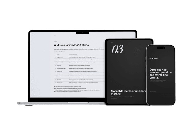
Material gratuito
E se a pessoa que criou sua marca sumisse amanhã?
Os 10 ativos que garantem que sua marca continue consistente, com ou sem quem a desenvolveu.
What builds brand perception is the consistent repetition of coherent elements over time. Every touchpoint where the brand appears is an opportunity to reinforce or weaken that perception.
When the system exists, every application reinforces. When it doesn't, every application is an interpretation. And inconsistent interpretations create brands that seem to have multiple personalities.
The most common mistake
Companies invest in a logo, not a system.
The logo turns out well. But when Instagram needs artwork, someone creates it with a different font. When the proposal needs a template, another designer makes it with different colors. When the badge is printed, the print shop uses the wrong version of the logo.
Result: the brand exists in the logo and gets lost in everything else.
Visual identity without a system isn't identity. It's an element.
What changes when visual identity is resolved
When the system exists and is applied consistently, the brand starts building territory.
The client recognizes before reading. Perception forms before the conversation. The brand looks the size the business actually is.
And perception at the right size isn't vanity. It's what determines whether the client arrives decided or arrives asking for a discount.
Perguntas frequentes
Is visual identity the same thing as a logo?
No. A logo is one of the elements, the most visible one, but visual identity is the complete system: logo, color palette, typography, graphic elements, photographic language, and visual tone working together.
What elements make up a complete visual identity system?
Logo and symbol, color palette, typography, graphic elements like patterns and icons, photographic language, and overall visual tone.
Why does a strong logo alone not build brand recognition?
Without a system behind it, every new application becomes an interpretation. Accumulated inconsistent interpretations create a brand that seems to have multiple personalities across different channels.
What's the commercial impact of finally having a proper visual identity system?
The client recognizes the brand before reading anything, perception forms before the conversation starts, and the brand looks the actual size of the business, which affects whether the client arrives decided or arrives asking to negotiate.
Material gratuito
E se a pessoa que criou sua marca sumisse amanhã?
Os 10 ativos que garantem que sua marca continue consistente, com ou sem quem a desenvolveu.
Ferramenta gratuita
Diagnóstico de marca
Responda o scorecard e receba o score da sua marca com uma leitura direta do resultado.
Fazer diagnóstico →
R$97
Agente FAMOSO.®
O processo que uso pra criar posts com tese, não conteúdo genérico. Acesso permanente.
Conhecer o agente →Leia também
- What a visual identity manual actually doesA visual identity manual isn't a file to store. It's the document that ensures your brand remains the same wherever it appears.
- The difference between logo, visual identity, and brandingThree concepts the market uses as synonyms. The confusion that makes companies spend and still have the same problem. Understand all three at once.
- Brand tone of voice: what it is and how to define yoursBrand tone of voice is your company's personality expressed in words. Understand what it is, why it matters, and how to define yours with clarity.
Escrito por Pedro Cardoso, fundador do FAMOSO.®, estúdio de branding em Porto Alegre.
← Ver todos os artigosDiagnóstico FAMOSO.®
Você não vende o que faz. Vende o que parece que faz.
Análise completa da sua marca mais uma call de 30 minutos. O valor vira crédito integral no projeto.
CONHECER O DIAGNÓSTICO