
The 10 best-looking World Cup 2026 kits
A ranking of the best-resolved kits of the 2026 World Cup, judged on concept and execution, not on favourite team. The 10 picks and the criteria.
Neste artigo
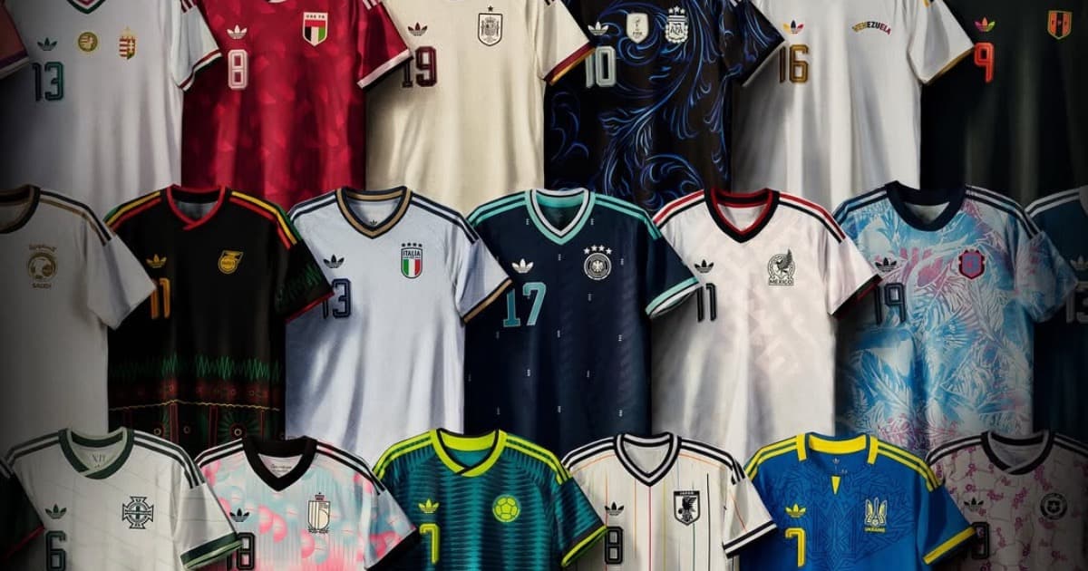
I'm not ranking by favorite team. I'm ranking by visual identity project. Concept, execution, coherence with the country's symbolic territory, and what stays in memory after the screen goes dark.
Ten kits. From the most fragile concept to the most complete.
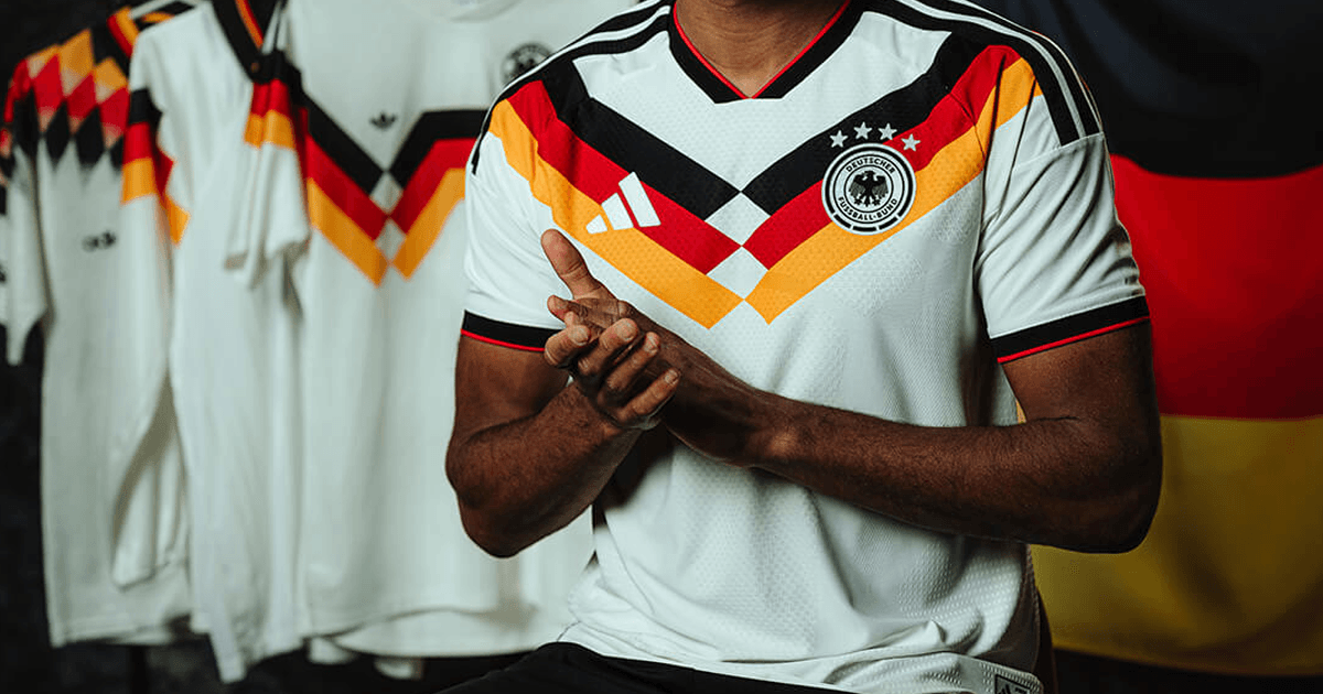
Germany kit (home)
White base with rhombus and chevron patterns in black, red, and gold, referencing the championship kits of 1990 and 2014. Last Adidas kit before the switch to Nike in 2027. Well-executed tribute, but a tribute. No creative tension, just reverence.
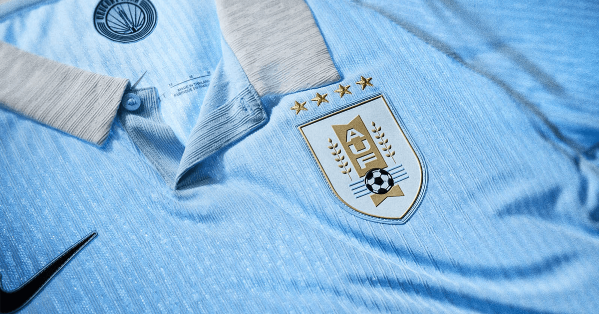
Uruguay kit (home)
Traditional sky blue, "garra charrúa" (Uruguayan grit). A bet on heritage over boldness. It works because Uruguay has enough historical repertoire to sustain simplicity without looking cheap.
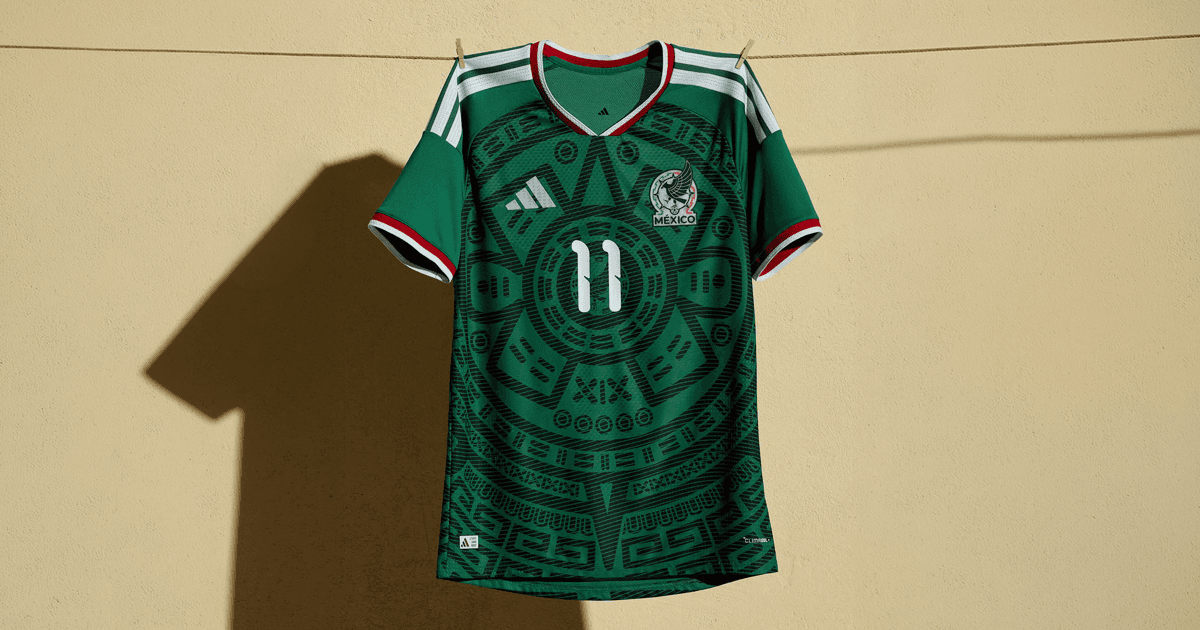
Mexico kit (home)
Deep green, geometric graphic from the 1998 kit reinterpreted. The main host's kit. It deepens its own visual mythology, but it's still refinement, not invention.
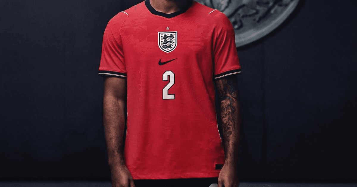
England kit (away)
Textured graphics: raised lions and stars on the fabric, referencing English football culture itself. The message behind it is reviving fan enthusiasm and the desire to bring the trophy home.
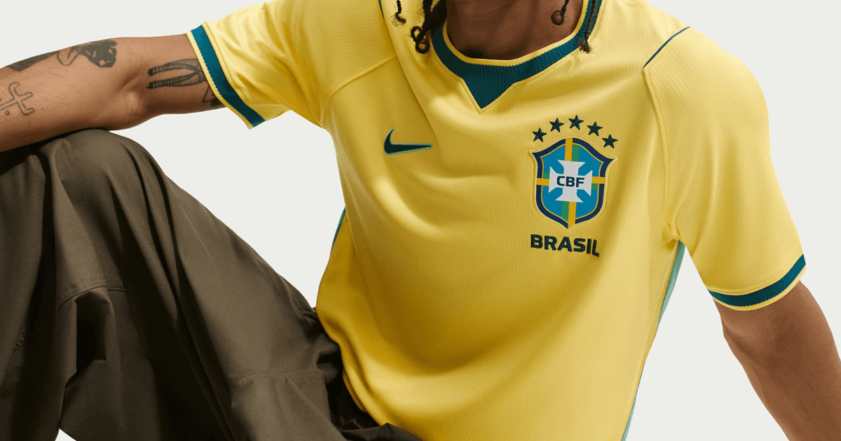
Brazil kit (home)
Historic canary yellow tone, a reference to the 1970 kit. No structural boldness, and it doesn't need any. It lands right in the middle: flawless execution on an idea that already existed, not a new one. The privilege of an established brand, and also its limit.
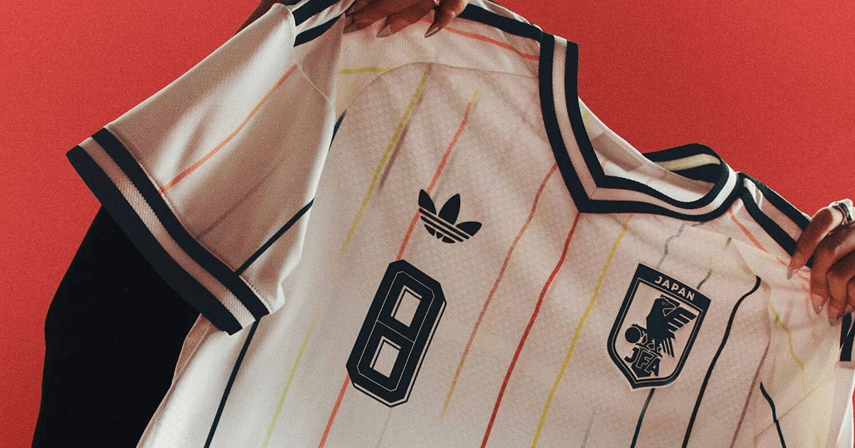
Japan kit (away)
Material gratuito
E se a pessoa que criou sua marca sumisse amanhã?
Os 10 ativos que garantem que sua marca continue consistente, com ou sem quem a desenvolveu.
12 vertical stripes: 11 represent each player on the field, the 12th represents the fans. A system that tells a story without needing explanatory text.
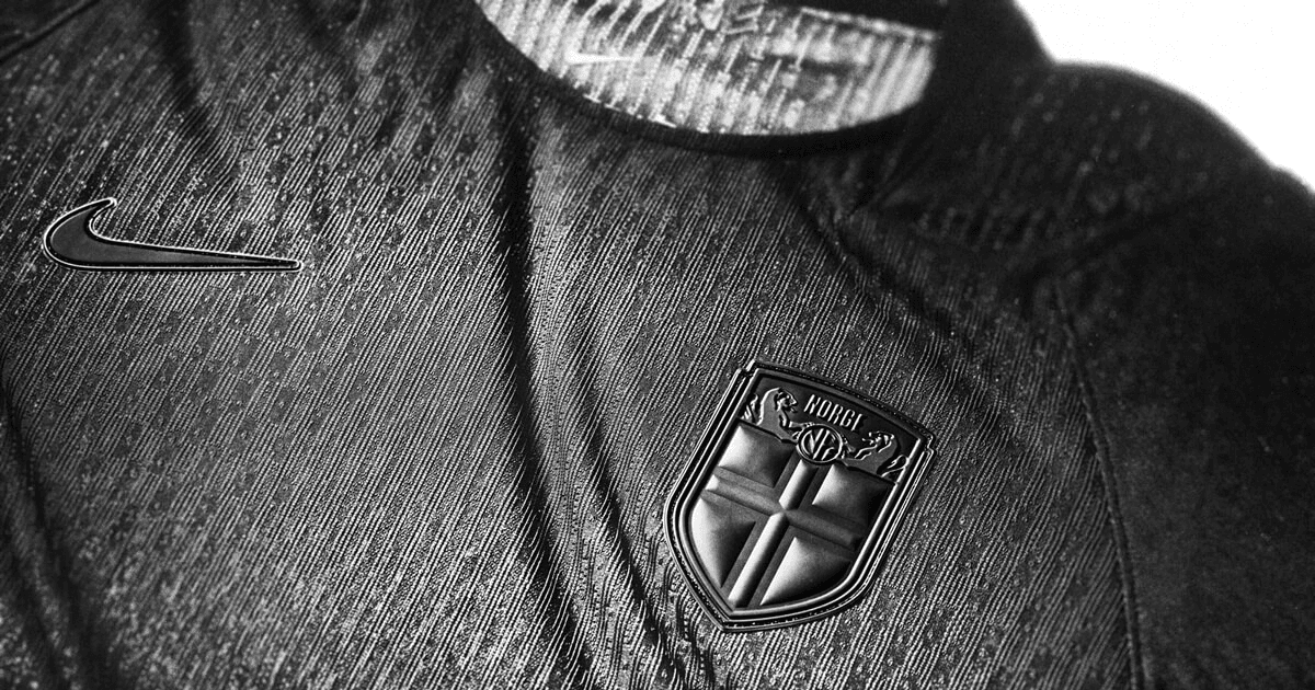
Norway kit (away)
The national team's first all-black kit, custom typography inspired by the Elder Futhark runic alphabet. It fixed in 2026 what FIFA banned in 2024 for lack of legibility. A brand that makes a mistake in public, learns, and comes back stronger.
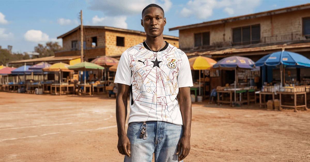
Ghana kit (away)
Golden yellow inspired by the Makola market in Accra, Adinkra symbols, Kente pattern. Co-directed by Ghanaian artist Prince Gyasi. Authorship from within the symbolic territory itself, not a generic outside cultural reference.
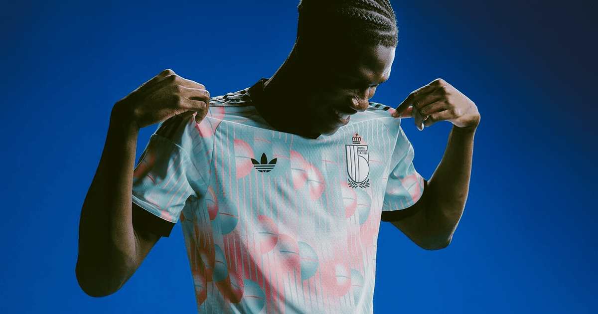
Belgium kit (away)
A tribute to painter René Magritte, the fourth time the national team has used its away kit to honor a pillar of national culture. Long-term positioning, not a one-season gimmick.
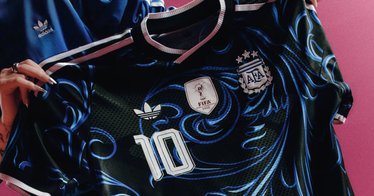
Argentina kit (away)
Fileteado Porteño pattern, a UNESCO heritage of Buenos Aires. Championship star in white for the first time. The only one among the ten that risks an entirely new idea and nails the execution down to every detail.
What these 10 kits teach about branding
None of the ten won on a pretty print. They won by telling something new, or lost position by just refining what already existed. The same logic applies to the logo of anyone who hasn't yet decided whether to repeat what they have or risk saying something new.
Perguntas frequentes
Which kit ranked highest in the 2026 World Cup design ranking?
Argentina's away kit, with the Fileteado Porteño pattern, a UNESCO heritage in Buenos Aires, and the championship star in white for the first time. It was the only one of the ten that risked an entirely new idea with flawless execution.
Did the ranking consider the favorite team or just the kit design?
Only the visual identity project: concept, execution, coherence with the country's symbolic territory, and what stays in memory after the World Cup ends.
What do these kits teach about brand building?
None of the ten won on a pretty print. The ones that stood out most told something new; the ones that just refined what already existed lost position in the ranking.
Did Brazil's kit rank well?
It landed in the middle of the list: flawless execution, but on an idea that already existed, a reference to the 1970 kit, with no new structural boldness.
Material gratuito
E se a pessoa que criou sua marca sumisse amanhã?
Os 10 ativos que garantem que sua marca continue consistente, com ou sem quem a desenvolveu.
Ferramenta gratuita
Diagnóstico de marca
Responda o scorecard e receba o score da sua marca com uma leitura direta do resultado.
Fazer diagnóstico →
R$97
Agente FAMOSO.®
O processo que uso pra criar posts com tese, não conteúdo genérico. Acesso permanente.
Conhecer o agente →Leia também
- What is visual identity, really?Visual identity is what makes your brand perceived a specific way before a word is said. Most companies treat it as just the logo.
- The difference between logo, visual identity, and brandingThree concepts the market uses as synonyms. The confusion that makes companies spend and still have the same problem. Understand all three at once.
- Why Your Brand Looks Amateur (and How to Fix It)Does your brand look amateur even though your business is serious? See the signs that make a brand look smaller than it is and what changes in perception.
- 2026 World Cup visual identity: the analysisThe official 2026 World Cup brand broke decades of convention: trophy inside the crest, modular system for 16 host cities. What changed and why it works.
- CazéTV broke a YouTube record: what it reveals21.2 million simultaneous devices, R$2 billion in sponsorship before kickoff. CazéTV proved brand trust doesn't depend on being a TV network.
Escrito por Pedro Cardoso, fundador do FAMOSO.®, estúdio de branding em Porto Alegre.
← Ver todos os artigosDiagnóstico FAMOSO.®
Você não vende o que faz. Vende o que parece que faz.
Análise completa da sua marca mais uma call de 30 minutos. O valor vira crédito integral no projeto.
CONHECER O DIAGNÓSTICO