
Why every digital bank wants to look like one of us
Neon launched an identity 'connected to the real life of Brazilians'. Escaping the serious-bank look became the fintech default. Here is what that costs.
Neste artigo
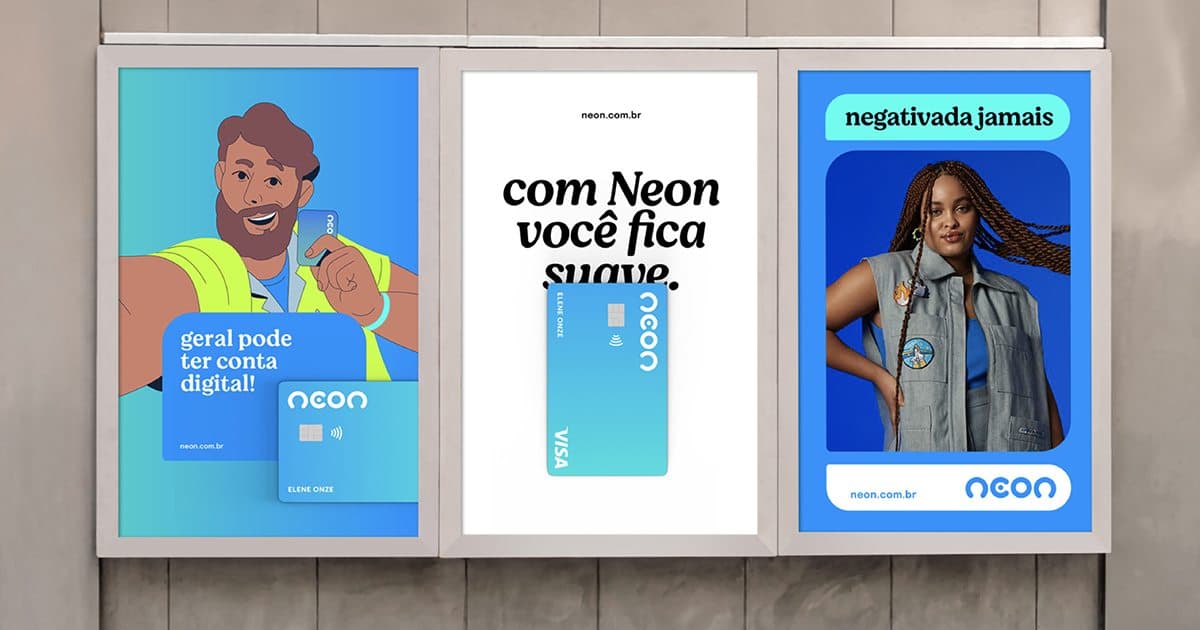
In July 2026 Neon launched a new visual identity described as connected to the real life of Brazilians. That phrase sums up an entire decade of Brazilian fintech: run away from the serious-bank look and sprint toward closeness, informality, the tone of someone who is just like you.
It made sense originally. Traditional banks spent years as the villain of the story: queues, fees, a manager who never picks up, cold marble. Fintech was born as the opposite of that, and the visuals followed. Vibrant color, light illustration, copy that reads like a WhatsApp conversation. It worked to separate the new from the old.
The problem shows up when everyone does the same thing.
When different becomes the new same
The closeness look was differentiation in 2015. In 2026 it is the standard. Purple, gradient, sans serif, illustrations of smiling people, a cute mascot, a best-friend tone. Open the main Brazilian fintech apps side by side and the distance between them has shrunk. The visual code that once said I am not a boring bank now says I am one more fintech.
This is the same mechanism that makes every AI startup have practically the same logo. A style starts as a signal of belonging to the right category, and at the saturation point it stops communicating difference. When an entire sector adopts the same tone, looking approachable positions nobody, because approachability became the price of entry, not an advantage.
Perception research shows the cost of this from another angle. Brands with their own visual and verbal signals are remembered faster and confused less. When the signals are shared by the whole category, the customer's brain files everyone in the same drawer and the choice falls back to the shallowest variable there is: who has the better offer this month.
Looking human is not the same as being distinct
There is a confusion at the bottom of this race. Being accessible, speaking plainly and treating customers without bureaucracy is good, and no bank should go back to cold marble. But accessible is a category attribute, not a brand attribute. If being just like you is what everybody promises, it does not set you apart from anyone.
Material gratuito
E se a pessoa que criou sua marca sumisse amanhã?
Os 10 ativos que garantem que sua marca continue consistente, com ou sem quem a desenvolveu.
Positioning is about occupying a place others do not occupy. When a fintech aims exactly where all the others already are (young, cool, close), it is competing in the most crowded territory in the market. The question almost nobody asks at rebranding time is: what am I that the competitor next door is not. Without that answer, the new look is just a facade renovation on a building identical to the neighbor's.
Fiat shows the opposite path. It did not try to be one more likable car brand. It bet on disappearing into Brazil, solving local problems, and built a perception no foreign competitor can copy. That is a place of its own. Generic closeness is not.
What to do when the whole category looks alike
For any business, not just fintech, the way out is not shouting the same speech louder. It is finding the axis where you are honestly different and anchoring the brand there, even if it is less cuddly than the average.
It might be a specific audience the big players ignore. It might be a way of operating the rest do not have the stomach to sustain. It might be a narrower product. What does not work is taking the category's visual playbook (the same color, the same illustration, the same best-friend tone) and expecting a cosmetic change of tone to fix a positioning problem.
When a brand decides to look like whatever is fashionable in its sector, it outsources its identity to a trend. And trends change. What remains is the brand that had the nerve to look like itself instead of like the category.
Neon wanting to connect to the real life of Brazilians is not the problem. The problem is that the same sentence would fit, word for word, almost every fintech in the country. And a brand that works for everyone positions no one.
Perguntas frequentes
What did Neon change in its identity in 2026?
Neon launched a new visual identity described as connected to the real life of Brazilians, part of the broader fintech movement toward looking close and informal instead of adopting the traditional bank look.
Why do digital banks look so similar?
Because the closeness look (vibrant color, sans serif, light illustration, informal tone) started as differentiation from traditional banks and became the category standard. When everyone adopts the same code, it stops communicating difference.
Is looking human and approachable bad for a brand?
Not in itself. The problem is that closeness became a category attribute promised by every fintech. Being accessible is the price of entry, not an advantage. Differentiation requires occupying a place competitors do not occupy.
How does a brand stand out when the whole sector looks the same?
By finding the axis where it is honestly different (an ignored audience, a way of operating, a narrower product) and anchoring the brand there, even if it is less cuddly than the average, instead of copying the category's visual playbook.
Material gratuito
E se a pessoa que criou sua marca sumisse amanhã?
Os 10 ativos que garantem que sua marca continue consistente, com ou sem quem a desenvolveu.
Ferramenta gratuita
Diagnóstico de marca
Responda o scorecard e receba o score da sua marca com uma leitura direta do resultado.
Fazer diagnóstico →
R$97
Agente FAMOSO.®
O processo que uso pra criar posts com tese, não conteúdo genérico. Acesso permanente.
Conhecer o agente →Leia também
- Why every AI startup has the same logoGradient, spark, lowercase wordmark, blue-purple. Open ten artificial intelligence brands and you'll see almost the same design. Looking alike has a cost.
- What brand positioning is (and why it costs you)Brand positioning isn't a slogan. It's the position your company occupies in the client's mind before any conversation. And it defines the price you can charge.
- Why Your Brand Looks Amateur (and How to Fix It)Does your brand look amateur even though your business is serious? See the signs that make a brand look smaller than it is and what changes in perception.
- Is Fiat Brazilian? The answer and what it hidesFiat is Italian and foreign-controlled. It still leads Brazilian car sales five years running and reads as local. The reason is not price.
Escrito por Pedro Cardoso, fundador do FAMOSO.®, estúdio de branding em Porto Alegre.
← Ver todos os artigosDiagnóstico FAMOSO.®
Você não vende o que faz. Vende o que parece que faz.
Análise completa da sua marca mais uma call de 30 minutos. O valor vira crédito integral no projeto.
CONHECER O DIAGNÓSTICO