
Why every AI startup has the same logo
Gradient, spark, lowercase wordmark, blue-purple. Open ten artificial intelligence brands and you'll see almost the same design. Looking alike has a cost.
Neste artigo

Try this test. Open the brands of the ten biggest artificial intelligence companies side by side. You'll notice an uncomfortable pattern: a geometric symbol that looks like a flower, a spark, or an abstract knot, almost always gradient, almost always in shades of blue and purple, next to a lowercase name in a rounded sans-serif font. Swap the names around and most of it would still work the same. An entire industry built nearly the same visual identity. And for anyone who understands brand, that's an expensive problem hiding inside something that looks like mere aesthetics.
Where the resemblance comes from
None of these companies copied each other on purpose. The convergence has concrete causes.
The first is the rush to signal category. An AI startup wants you to understand, in the first second, that it's modern, technological, and of the future. There's a visual repertoire that became shorthand for saying that: gradient, glow, fluid shapes. Everyone reaches for the same repertoire because it communicates "technology" fast, and the result is everyone ends up looking the same.
The second is fear of getting it wrong. Looking like the category leader feels safe. If the reference brands have that look, copying that look seems to reduce risk. Except the sum of a lot of people individually reducing risk produces a sea of collective sameness.
The third is the tool itself. A lot of this identity work is put together fast, sometimes with the help of generators, starting from the same references already circulating. When everyone starts from the same point, everyone ends up in the same place. It's the risk of treating identity as a piece a tool can solve, instead of a positioning decision.
What sameness costs
Looking like everyone else destroys a brand's most basic function, which is to differentiate. A visual identity exists so people recognize you and set you apart from everyone else. When ten companies use the same visual language, none of them accomplishes that. The customer can't remember which was which, and the brand becomes noise instead of signal.
Material gratuito
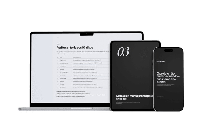
E se a pessoa que criou sua marca sumisse amanhã?
Os 10 ativos que garantem que sua marca continue consistente, com ou sem quem a desenvolveu.
In a crowded, noisy category, that's even more serious. The more competitors show up, the more valuable the ability to be recognized at a glance becomes, and the more expensive the decision to be just one more of the pack. A brand that looks like all the others has to spend far more on attention to earn the same space in memory that a distinct brand occupies for free.
There's also a perceived-value cost. When everything looks the same, the customer has no way to read a difference in quality, and without that read, they go back to deciding on price. Visual sameness pushes the entire category into price competition, exactly the place a strong brand should avoid.
Differentiating isn't about being weird
The wrong reaction to this is thinking it's enough to be different at any cost, inventing a bizarre look just to avoid resembling anyone. Differentiation isn't eccentricity. It's finding what's true about that company and translating it into a language of its own, coherent and consistent.
The path starts before the drawing, at positioning. What is this company that the others aren't. Who is it talking to. What perception does it need to project. An identity that answers that naturally separates itself from the pack, because it starts from something only that company has, instead of starting from the generic repertoire everyone uses. It's the difference between building an identity and picking a look off the shelf.
The irony of the AI industry is that it sells differentiation as a product, promises to make every customer unique and more competitive, and at the same time presents itself with interchangeable brands. In a market where everyone looks the same, the most strategic decision is rarely having the prettiest gradient. It's having the courage to have no gradient at all when everyone else does.
Perguntas frequentes
Why do almost all AI startups have the same type of logo?
For three reasons: the rush to signal category with a visual repertoire that became shorthand for technology, fear of getting it wrong by copying the category leader, and use of the same tools and references.
Does having a logo similar to competitors' carry any real risk?
Yes. It destroys a brand's most basic function, which is to differentiate. When multiple companies use the same visual language, customers can't remember which was which, and the brand becomes noise.
Do similar-looking brands affect what the market accepts paying?
Yes. When everything looks the same, customers can't read a difference in quality and go back to deciding on price, pushing the entire category into price competition.
Does differentiating a brand mean being weird or avoiding the obvious at any cost?
No. Differentiation isn't eccentricity, it's finding what's true about the company and translating it into a language of its own, coherent and consistent, starting with positioning before the drawing.
Material gratuito
E se a pessoa que criou sua marca sumisse amanhã?
Os 10 ativos que garantem que sua marca continue consistente, com ou sem quem a desenvolveu.
Ferramenta gratuita
Diagnóstico de marca
Responda o scorecard e receba o score da sua marca com uma leitura direta do resultado.
Fazer diagnóstico →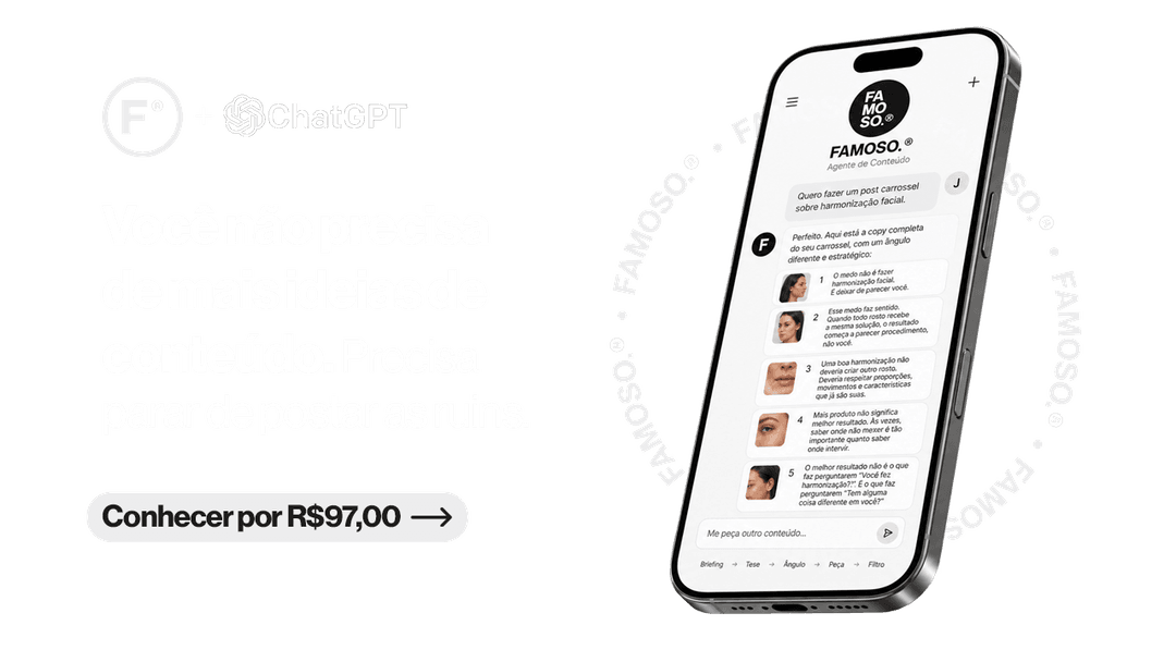
R$97
Agente FAMOSO.®
O processo que uso pra criar posts com tese, não conteúdo genérico. Acesso permanente.
Conhecer o agente →Leia também
- AI-generated logos: the risk nobody tells you aboutAn AI-generated logo is fast and cheap, but the bigger risk isn't aesthetic, it's legal, before you use one.
- What is visual identity, really?Visual identity is what makes your brand perceived a specific way before a word is said. Most companies treat it as just the logo.
- The difference between logo, visual identity, and brandingThree concepts the market uses as synonyms. The confusion that makes companies spend and still have the same problem. Understand all three at once.
- AI Generates Assets, But Doesn't Decide PositioningClaude writes a manifesto, generates a palette, drafts copy in seconds. What it doesn't do alone: decide positioning.
Escrito por Pedro Cardoso, fundador do FAMOSO.®, estúdio de branding em Porto Alegre.
← Ver todos os artigosDiagnóstico FAMOSO.®
Você não vende o que faz. Vende o que parece que faz.
Análise completa da sua marca mais uma call de 30 minutos. O valor vira crédito integral no projeto.
CONHECER O DIAGNÓSTICO