
Your brand's typography says more than the logo
Before reading the word, the customer already felt the font. Why typography carries more perception than the logo.
Neste artigo
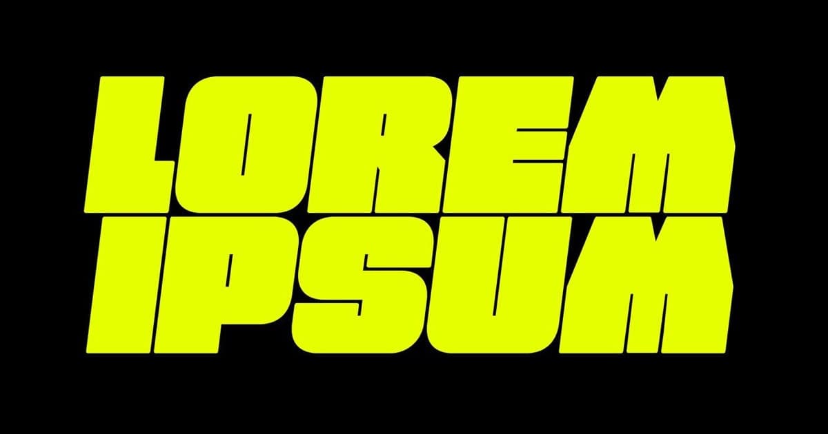
The customer feels the font before reading the word. A price set in a thin serif communicates something different from the same price in a heavy rounded font. Your product name in condensed, tight type communicates a different position from the same name in a wide, spaced face. None of this is a conscious decision by the person looking. It is perception, and it arrives before the text.
Even so, typography is the part of visual identity most people ignore. The conversation stays on the logo, the color, the symbol. The font is treated as a technical detail, when it is the element that appears in more places than any other: across the whole website, in every price, in every email, in every caption. The logo appears once per screen. Typography is there the whole time.
Why a font carries so much perception
Typography is a brand's body language. It does not say what you say, it says how you say it. A classic serif suggests tradition, authority, old money. A geometric sans suggests technology, clarity, modernity. A handwritten face suggests handmade, close, human. Customers read those signals in milliseconds, without knowing they are reading.
That is why a premium brand almost never uses a common system font. It is not snobbery. The wrong font gives away the wrong positioning. A service that wants to charge a lot, written in the default font of any document, loses credibility before the first sentence, and it is one of the reasons brands look amateur without the owner being able to say why.
The reverse is also true. Part of what makes a brand look expensive is typography behaving with discipline: a small number of weights, consistent spacing, clear hierarchy between headline and body. That costs almost nothing and changes everything in perception.
Big brands have gotten this wrong and reversed course
The best known case is Burberry. In 2018 the brand swapped its historic serif for a generic sans serif, in the middle of a wave in which several luxury houses adopted nearly identical fonts. The look became modern and became identical to everyone else's. In 2023 Burberry returned to a serif, bringing back the historic knight and the personality it had thrown away.
Material gratuito
E se a pessoa que criou sua marca sumisse amanhã?
Os 10 ativos que garantem que sua marca continue consistente, com ou sem quem a desenvolveu.
The lesson is not that serif is good and sans serif is bad. The lesson is that changing typography for fashion, to look like whatever is trending in the category, erases what the brand had of its own. Burberry paid five years of diluted identity to relearn that. A smaller company does not have five spare years to spend.
The opposite is Coca-Cola, which has sustained the same typographic style for more than a century and turned it into an asset. The font became such a strong recognition signal that nobody needs to read the name to know whose it is.
How to choose and use your brand's typography
The common mistake is choosing a font by the owner's personal taste. The right criterion is perception: what feeling does this font convey, and does that feeling match what I sell. A law firm and a children's candy brand should not use the same type family, because they promise different things.
A few principles solve most cases:
- →Use at most two type families: one for headlines, one for body. More than that becomes noise and gives away the lack of a system.
- →Prefer consistency over variety. The same font repeated everywhere builds recognition. A different font in every piece destroys it.
- →Mind the spacing. A good share of the expensive-brand feeling comes from generous spacing and disciplined alignment, not from the font itself.
- →Treat the font as a fixed part of the identity, the same way you treat the logo. It goes into the brand guidelines and does not change on a whim.
Typography is the cheapest element to get right and the most expensive to ignore. The logo is something the customer sees now and then. The font is something they read at every touchpoint, whispering who you are long before you open your mouth.
Perguntas frequentes
Why does typography matter so much in brand identity?
Because the font appears in more touchpoints than any other element (site, prices, emails, captions) and communicates a feeling before the text is read. It is the brand's body language: it does not say what you say, it says how you say it.
Serif or sans serif: which conveys more credibility?
It depends on what the brand sells. Serif suggests tradition and authority, sans serif suggests technology and clarity, handwritten suggests handmade and close. There is no universally right font, only a font coherent with the positioning.
How many fonts should a brand use?
At most two families: one for headlines and one for body text. More than that becomes visual noise and gives away the lack of a system. Consistency with the same font builds recognition; variety destroys it.
Is it worth changing the brand font to follow a trend?
Rarely. Burberry swapped its historic typeface for a fashionable sans serif in 2018 and reversed course in 2023 after losing personality. Changing fonts for fashion erases what the brand has of its own and makes it look like the category.
Material gratuito
E se a pessoa que criou sua marca sumisse amanhã?
Os 10 ativos que garantem que sua marca continue consistente, com ou sem quem a desenvolveu.
Ferramenta gratuita
Diagnóstico de marca
Responda o scorecard e receba o score da sua marca com uma leitura direta do resultado.
Fazer diagnóstico →
R$97
Agente FAMOSO.®
O processo que uso pra criar posts com tese, não conteúdo genérico. Acesso permanente.
Conhecer o agente →Leia também
- What is visual identity, really?Visual identity is what makes your brand perceived a specific way before a word is said. Most companies treat it as just the logo.
- What a visual identity manual actually doesA visual identity manual isn't a file to store. It's the document that ensures your brand remains the same wherever it appears.
- Why Your Brand Looks Amateur (and How to Fix It)Does your brand look amateur even though your business is serious? See the signs that make a brand look smaller than it is and what changes in perception.
- The difference between logo, visual identity, and brandingThree concepts the market uses as synonyms. The confusion that makes companies spend and still have the same problem. Understand all three at once.
Escrito por Pedro Cardoso, fundador do FAMOSO.®, estúdio de branding em Porto Alegre.
← Ver todos os artigosDiagnóstico FAMOSO.®
Você não vende o que faz. Vende o que parece que faz.
Análise completa da sua marca mais uma call de 30 minutos. O valor vira crédito integral no projeto.
CONHECER O DIAGNÓSTICO