
Hmidia
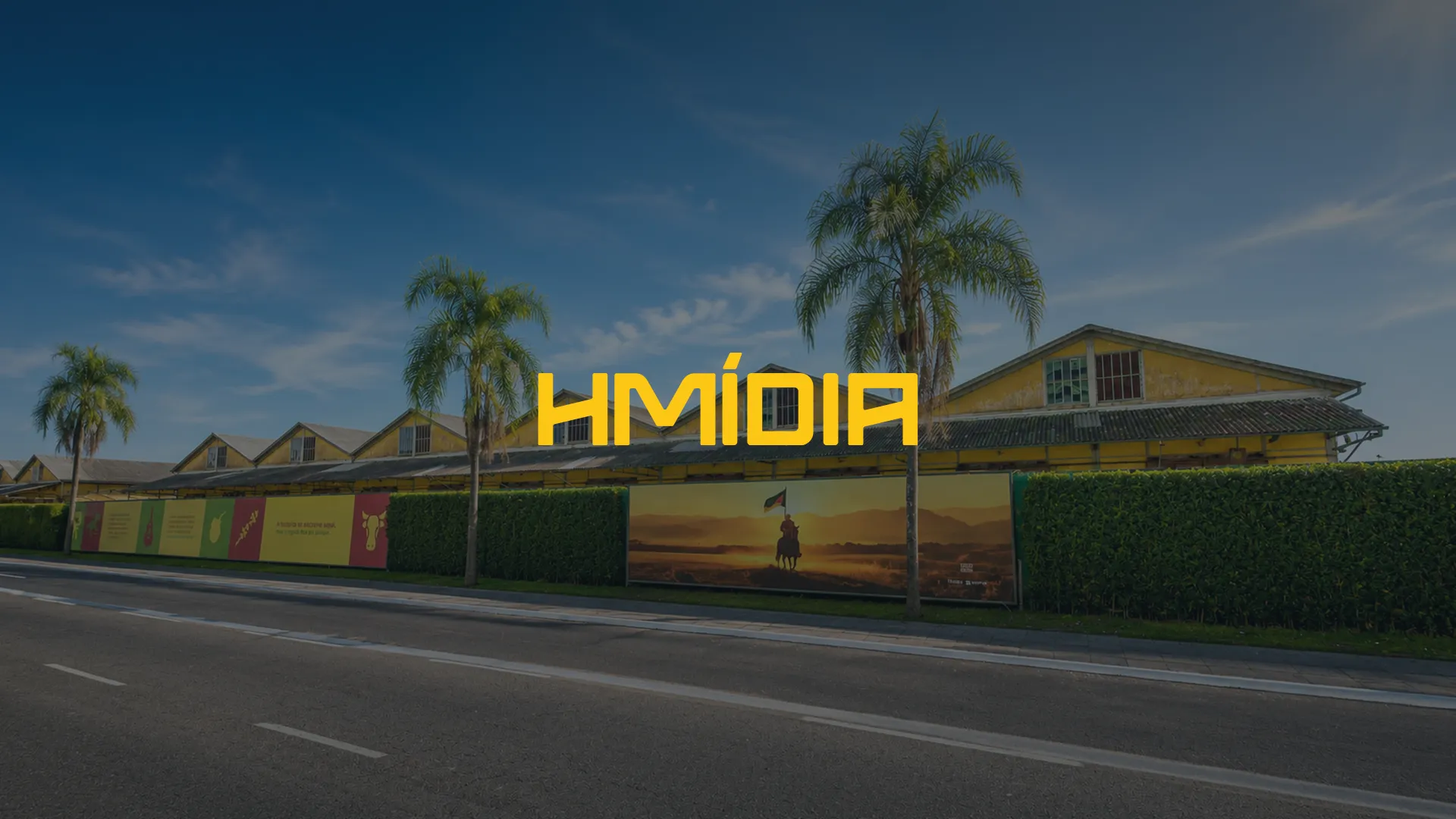
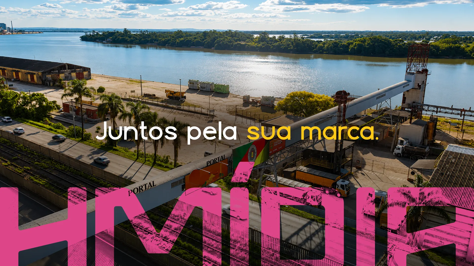
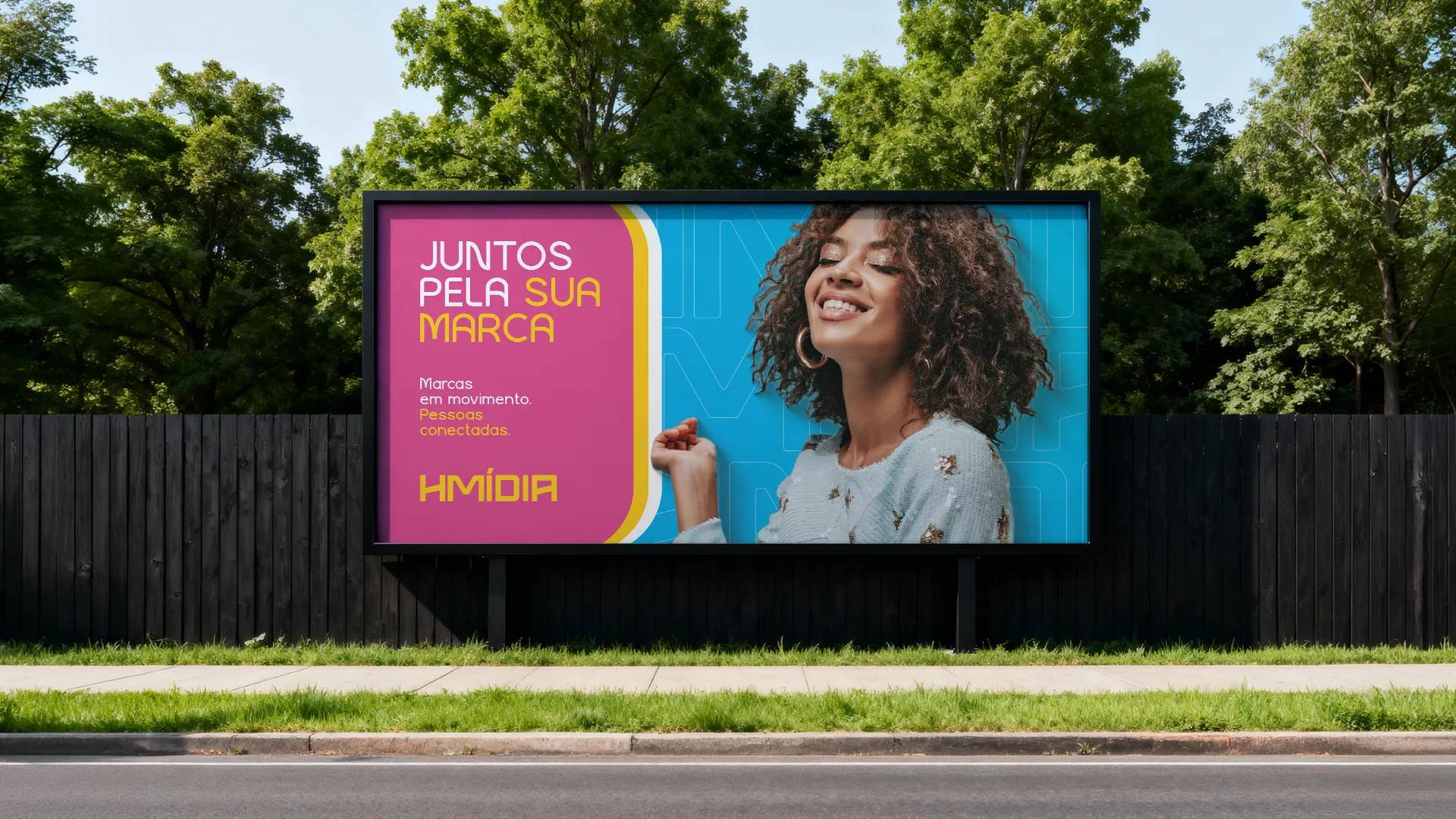
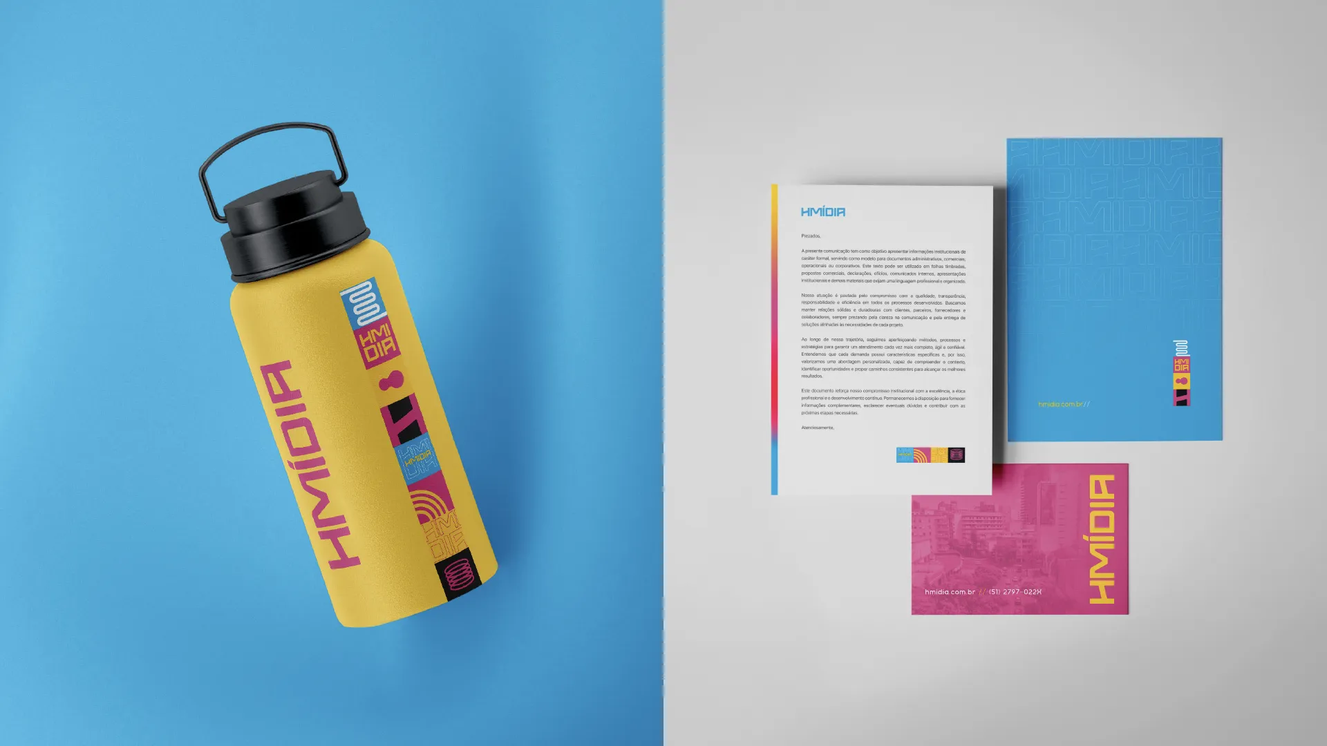
Full rebranding for an out-of-home media company in Rio Grande do Sul, with new visual identity and brand language that matches its real market scale.
Mídia · OOH/DOOH · Porto Alegre, RS, Brasil
THE PROBLEM
Leading OOH and DOOH media company in Rio Grande do Sul, 20 years in the market and more than 1,300 media faces across the state, but carrying an outdated brand that didn't communicate the scale of the business. A large company looking mid-sized. In media, where brand perception directly affects how much advertisers are willing to pay for the space, that costs real money.
THE SHIFT
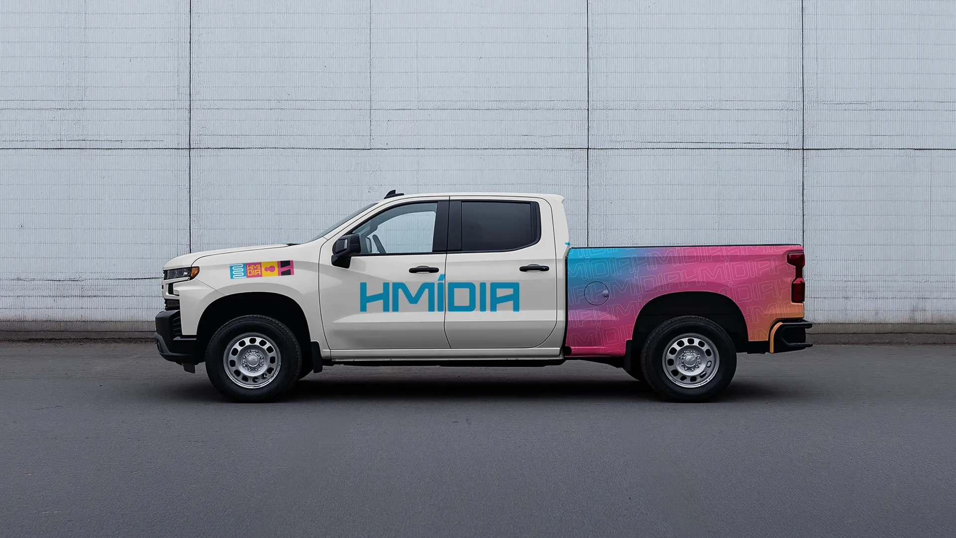
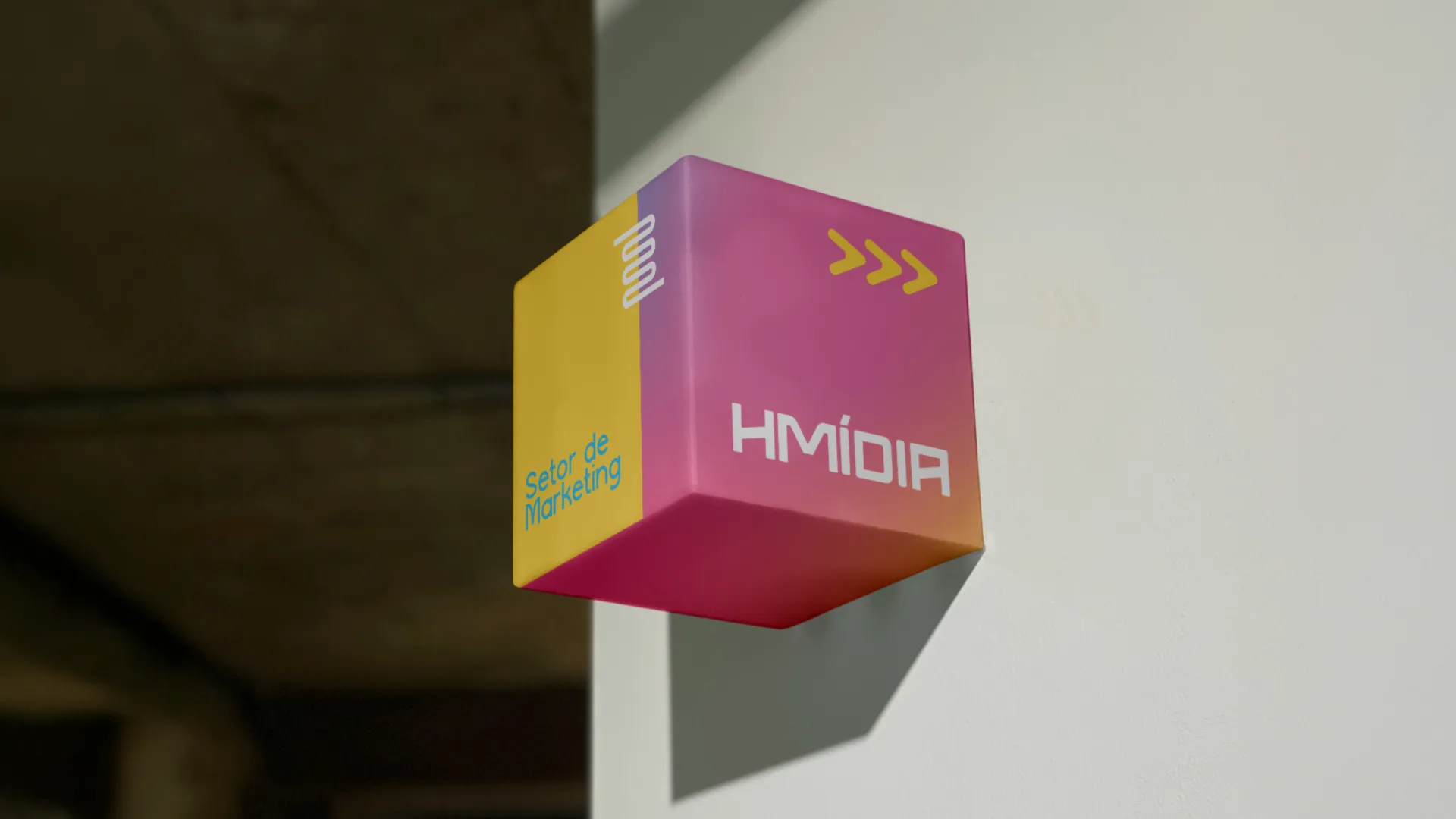
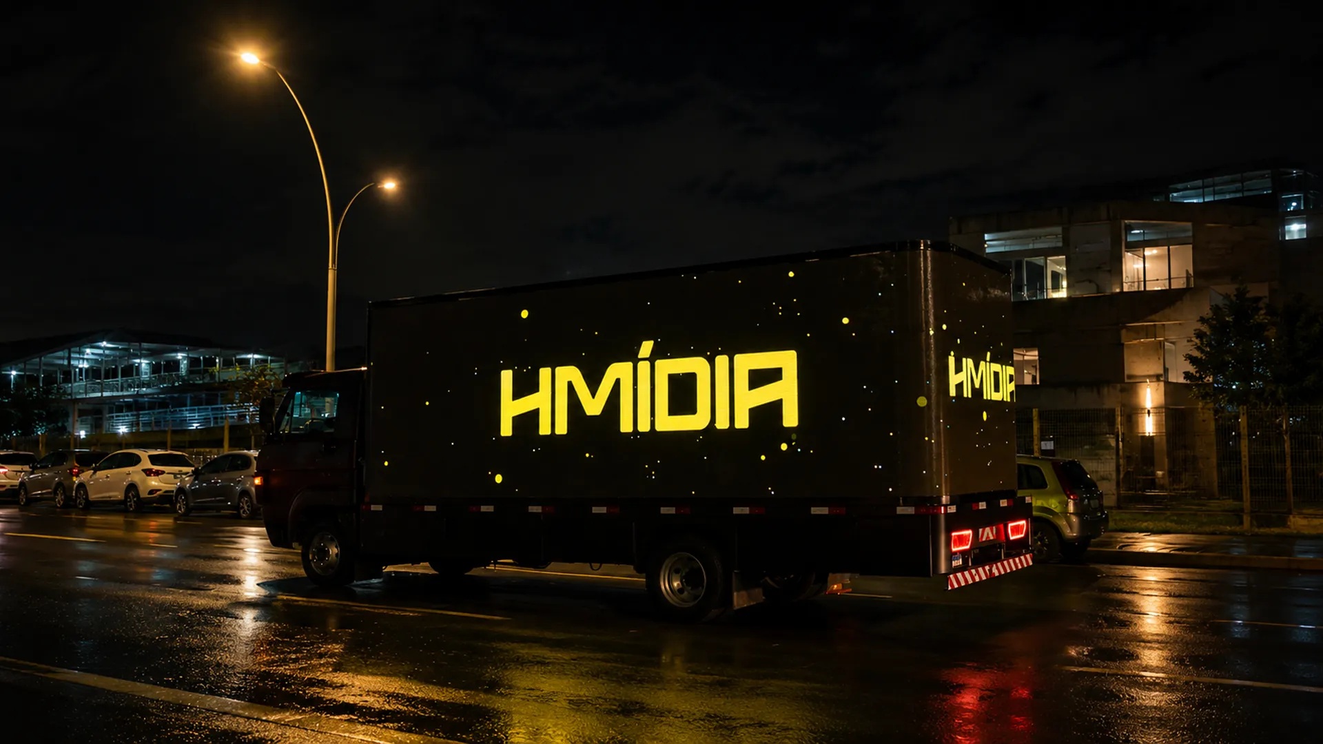
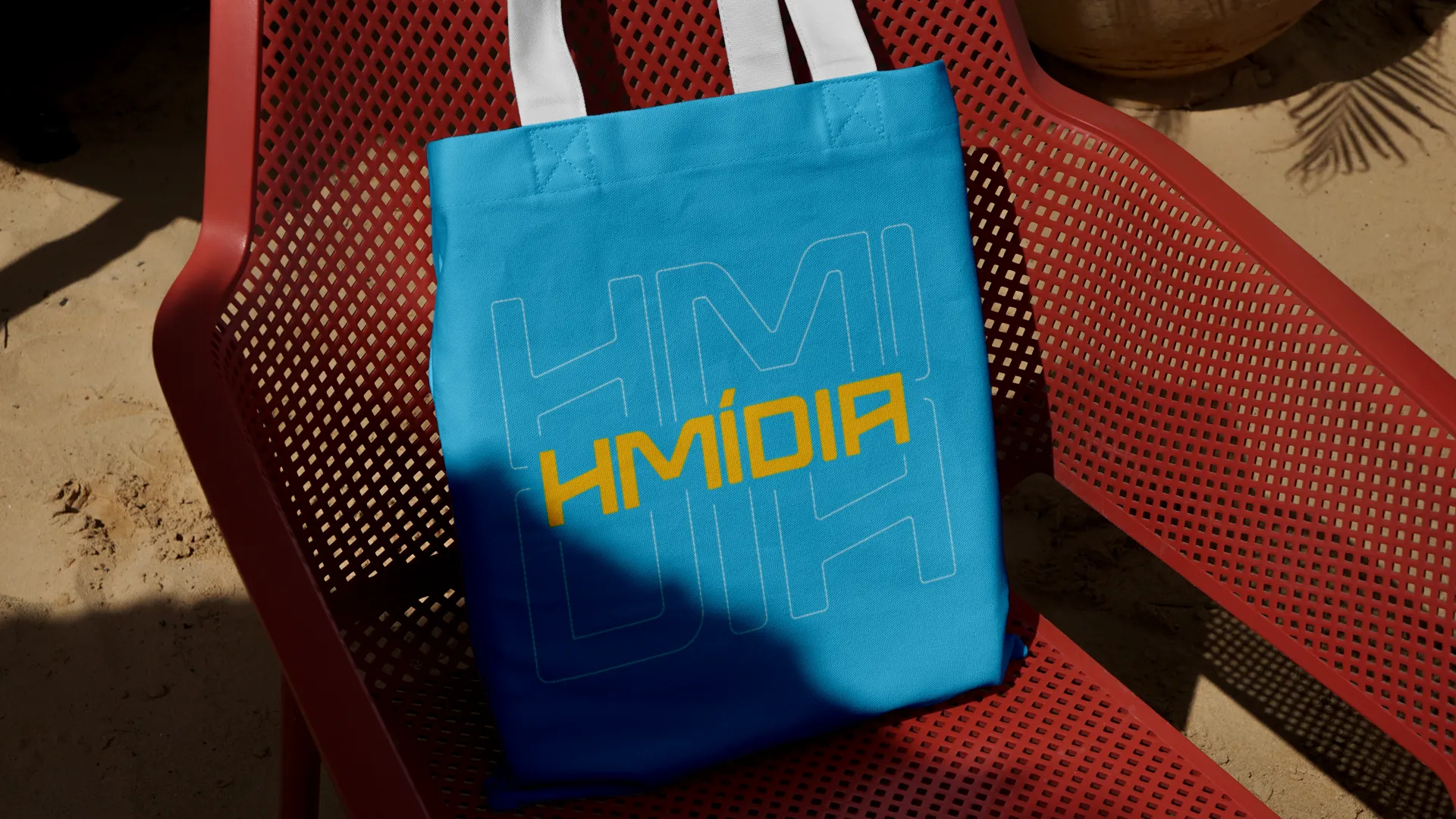
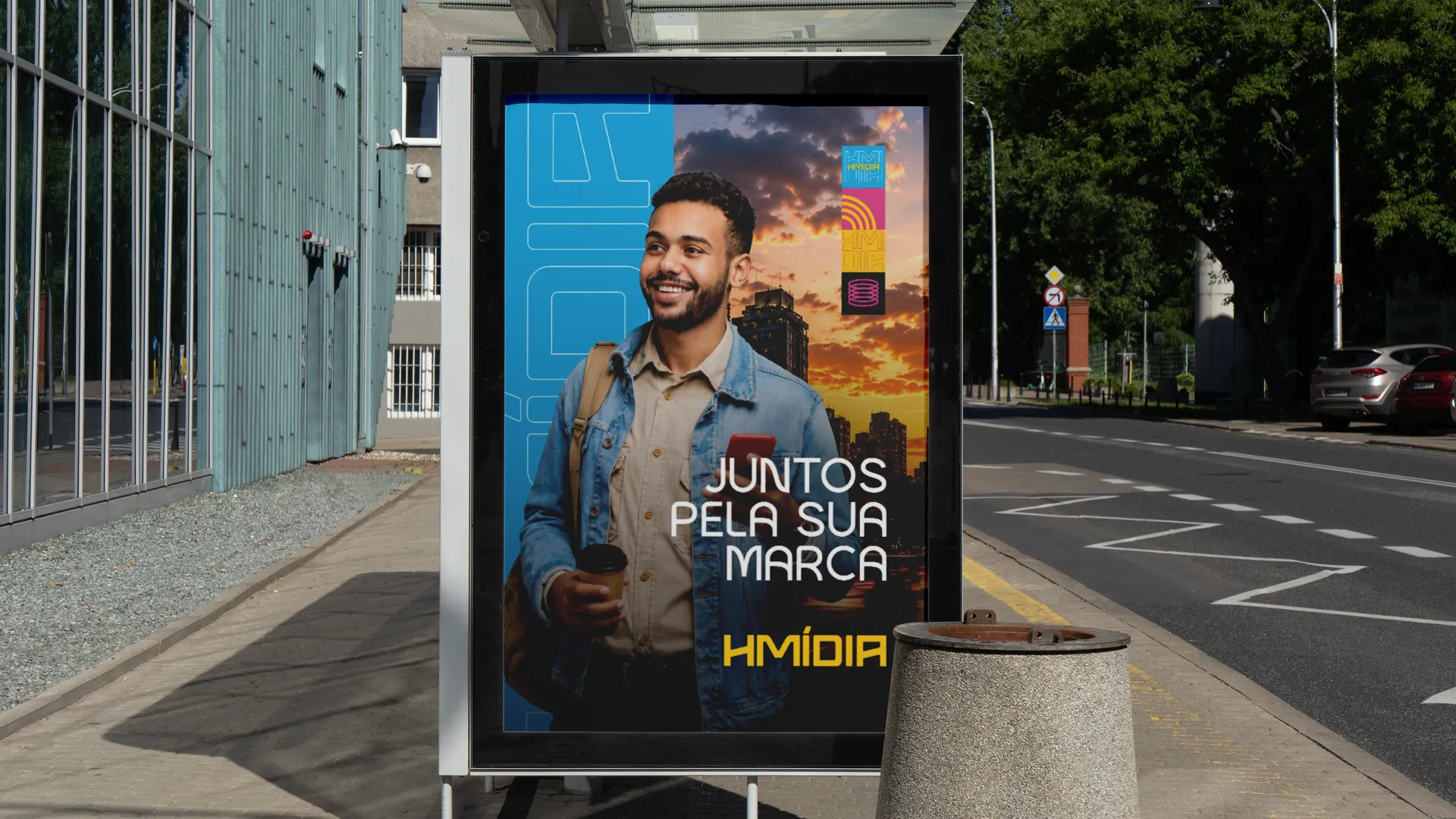
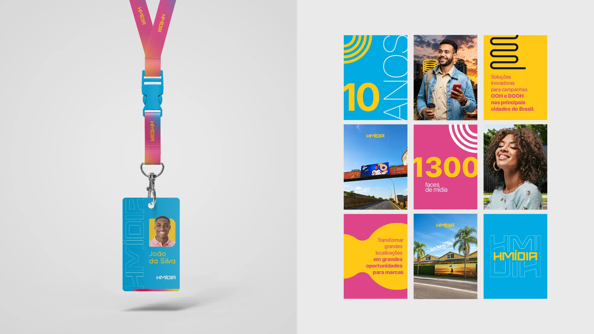
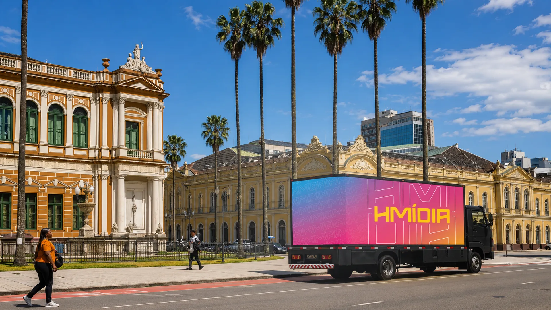
Full rebranding built on the positioning 'brands in motion, people connected.' Typography in flow, saturated palette (blue, magenta, yellow), visual system that moves like the product Hmidia sells, the city in motion. The brand started to look like what it always was: a regional leader operating at national scale.
THE RESULT
Hmidia now operates with a brand that matches its actual size. It speaks on equal terms with national advertisers, sustains premium media pricing and opens doors that an outdated brand was closing at first contact. A leader's brand charges like a leader.
Art direction and visual strategy: Pedro Cardoso, FAMOSO.®
Made in partnership with Agência JKR