Golden Training
Fitness · Academia · Porto Alegre, Brasil
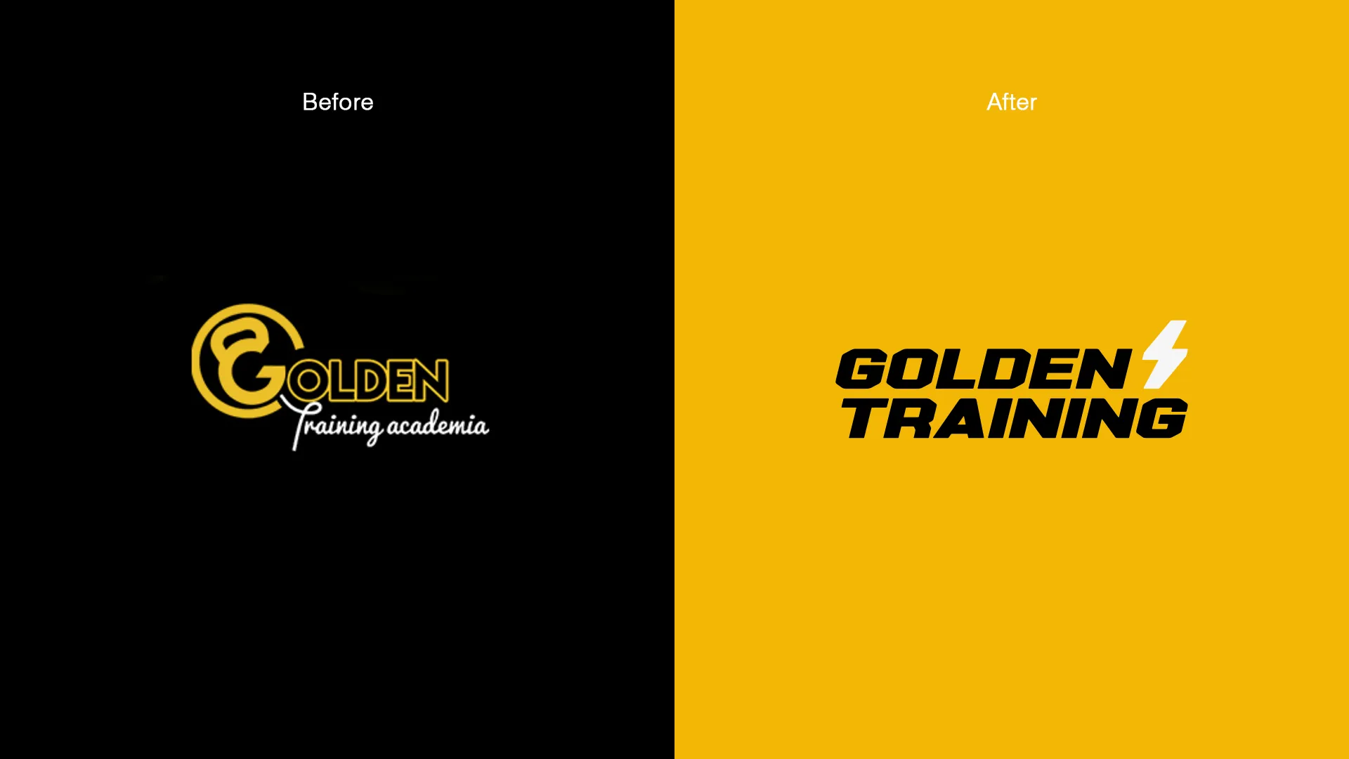
A 10-year-old gym, loyal audience, steady revenue — but stuck on price. The surrounding market kept moving up (boutique fitness, higher monthly fees) and Golden was still charging like a neighborhood gym, because the brand didn't grant permission to charge more. Every attempt to raise prices ran into resistance. Not because the client couldn't pay — because the brand didn't justify the new price.
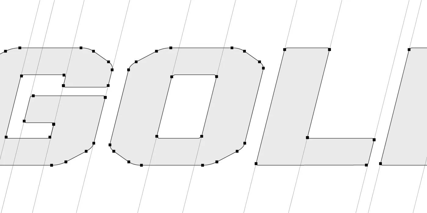
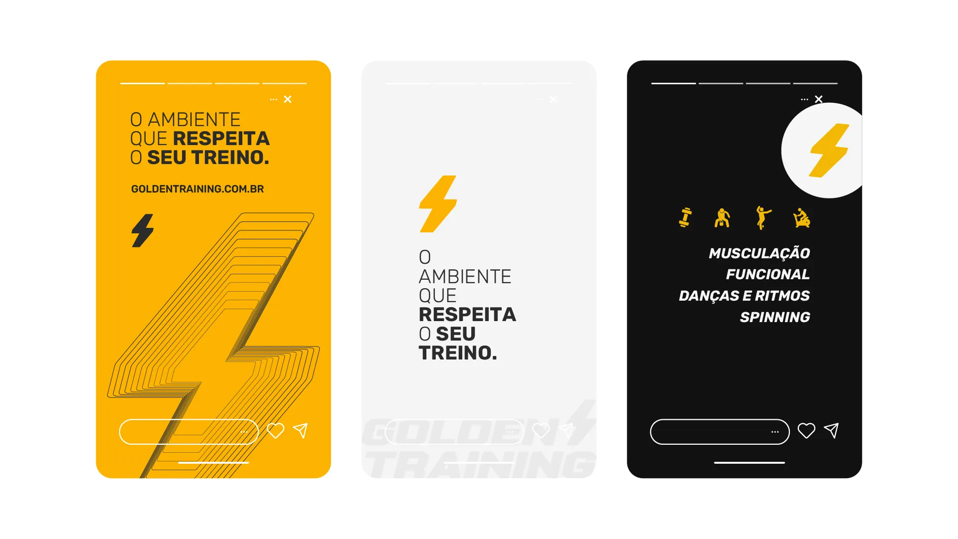
Full repositioning. Brand rebuilt from symbol to system, with technical typography, a palette built on tension between deep black and golden yellow, and a visual language at the level of premium fitness. Golden moved out of 'gym nearby' and into 'gym that respects the athlete's process' — a category where higher fees stop being an objection and start being a fit.
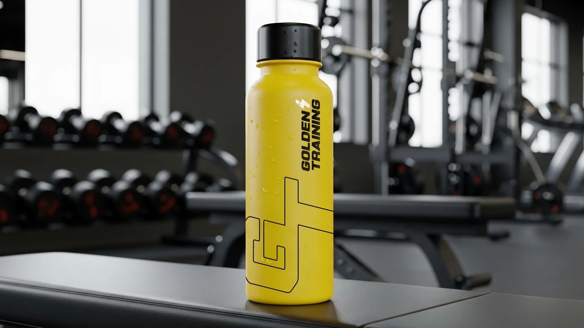
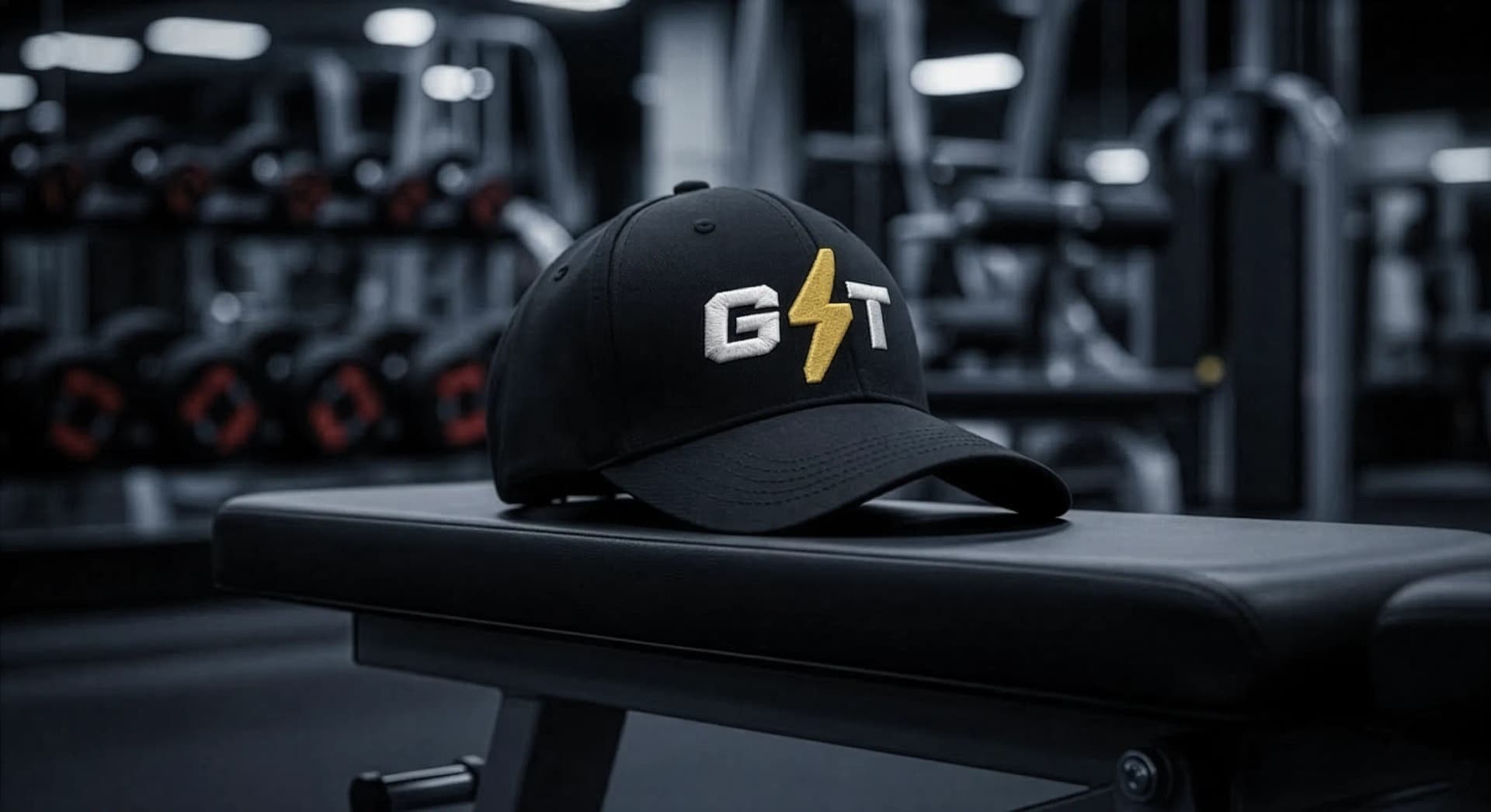
The brand now sustains the price point the business needs to charge. The new client arrives expecting to pay more — because the entire visual experience prepares that perception before the price is even mentioned. It also opened space for a proprietary product line — uniform, cap, bottle, towel, weight plates — adding new revenue and reinforcing authority.