
Coca-Cola rebrand 2026: what actually changed
Coca-Cola revised its visual system across 200+ markets and never touched the 1886 logo. What moved, what stayed and why it is a masterclass.
Neste artigo
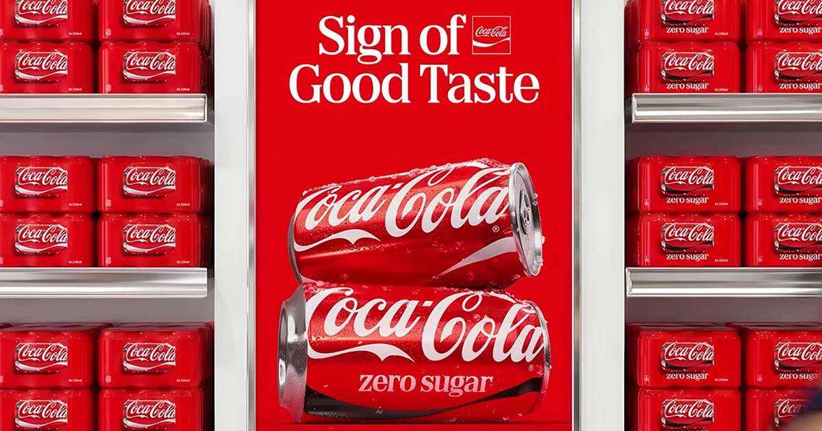
In early July 2026 Coca-Cola began rolling out a new visual identity system across more than 200 markets. The word rebranding scared a lot of people who pictured the cursive logo disappearing. That is not what happened. The Spencerian script, drawn in 1886, is exactly where it has always been. What changed is everything around it.
That distinction is the first lesson of the case. Most business owners think visual identity means the logo. Coca-Cola just showed the entire world that the logo is the part that changes least.
What Coca-Cola touched and what it left alone
The new system standardizes how the brand behaves: the red band, the way secondary typography shows up on packaging, the use of color, the hierarchy between the script and everything else. The company described the goal as making the logo more dynamic and scalable, meaning it works the same way on a can label, a stadium screen and an app icon.
What did not change is the core. The red, the white script, the wave. Those elements are what branding calls distinctive assets: the signals a customer's brain recognizes before reading a single word. A 140-year-old brand does not touch them, because every pixel of accumulated recognition there is worth money.
Interbrand values Coca-Cola among the most valuable brands on the planet, in the tens of billions of dollars in brand value alone, separate from the value of the company. A large share of that number is tied to the permanence of those elements. Replacing the script would destroy an asset, not refresh a brand.
Refreshing the system is not replacing the logo
Here is the mistake that costs smaller companies dearly. The owner gets tired of the brand long before the market does, and the urge to change lands on the one thing that should not change: the logo. Customers get bored of a logo much later than owners do, because the owner looks at it every day and the customer sees it once in a while.
What is usually dated is not the symbol, it is the system: colors that drift off standard, typography that changes from piece to piece, an Instagram that looks nothing like the website, packaging that does not speak to the business card. That is what Coca-Cola fixed. It did not reinvent the brand, it organized the mess that had piled up around a symbol that already worked.
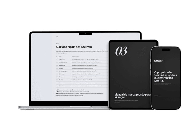
Material gratuito
E se a pessoa que criou sua marca sumisse amanhã?
Os 10 ativos que garantem que sua marca continue consistente, com ou sem quem a desenvolveu.
Anyone who understands the difference between logo, visual identity and branding solves the right problem. Anyone who does not pays a designer to draw a new logo, spends the budget on the wrong element, and ends up with the same inconsistency as before, now with a different symbol.
When the big change is justified
There is an opposite extreme, and KFC redesigned its brand precisely while it was losing customers. Sometimes a brand needs deep change because perception is stuck somewhere bad and no cosmetic adjustment will move it. The question that separates the two cases is simple: is the problem recognition or meaning.
If people recognize the brand but associate the wrong thing with it (too cheap, dated, untrustworthy), the change has to start with positioning, and the visuals follow. If people do not remember the brand at all, the problem is consistency and presence, not a new drawing. Coca-Cola has neither problem. It has decades and countries of accumulated material, and it decided to unify before the mess started diluting recognition.
The lesson that works at any size
You do not have 200 markets or 140 years. You do have the same principle at your scale. A brand's strength comes from repeating the same signals until they stick in the head of whoever buys. Every time you change the color, switch the font, redraw the logo out of boredom, you erase part of that accumulation and go back to zero on recognition.
Coca-Cola can spend a fortune re-educating the market about a new system. A small company cannot. For you, cheap consistency is worth more than expensive reinvention. Pick the few elements that will represent you (one color, one typeface, one way of doing things) and repeat them to exhaustion. It is less exciting than a rebranding, and it is what actually builds perception.
Coca-Cola's rebranding made the news because the brand is enormous. The lesson, though, is the cheapest one there is: take care of the system, stop redrawing the symbol.
Perguntas frequentes
Did Coca-Cola change its logo in 2026?
No. The cursive logo drawn in 1886 is unchanged. What Coca-Cola revised was the visual identity system around it: color, secondary typography, hierarchy and how the brand behaves across formats, in more than 200 markets.
What is the difference between changing the logo and refreshing the identity?
Changing the logo means touching the central symbol, the element with the most accumulated recognition. Refreshing the identity means organizing the system around it (colors, fonts, applications) without destroying that recognition. In most cases the problem is the system, not the logo.
Why does Coca-Cola keep the same logo even in a rebranding?
Because the white script, the red and the wave are distinctive assets with decades of accumulated recognition. That recognition is a core part of brand value, measured in the tens of billions of dollars. Replacing it would destroy an asset instead of refreshing the brand.
Should my company follow this example?
Yes, in principle. A small company cannot afford to re-educate the market about a new look, so cheap consistency beats expensive reinvention. Pick a few elements (one color, one typeface, one way of doing things) and repeat them until they stick, instead of redrawing the logo out of boredom.
Material gratuito
E se a pessoa que criou sua marca sumisse amanhã?
Os 10 ativos que garantem que sua marca continue consistente, com ou sem quem a desenvolveu.
Ferramenta gratuita
Diagnóstico de marca
Responda o scorecard e receba o score da sua marca com uma leitura direta do resultado.
Fazer diagnóstico →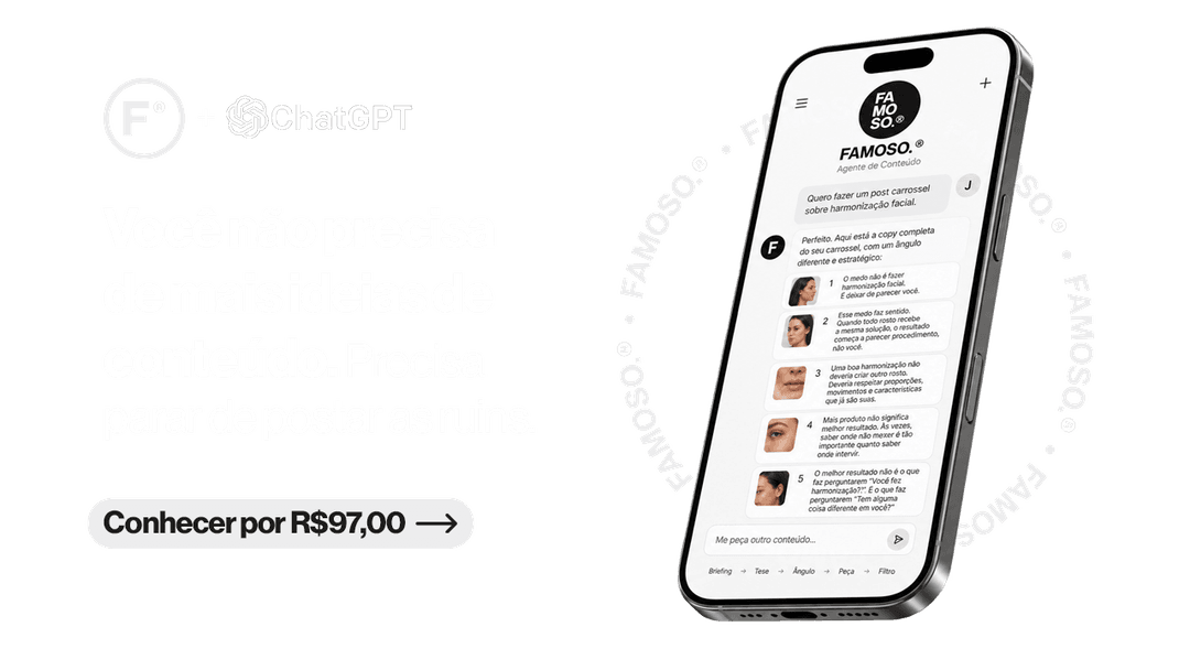
R$97
Agente FAMOSO.®
O processo que uso pra criar posts com tese, não conteúdo genérico. Acesso permanente.
Conhecer o agente →Leia também
- Why KFC redesigned its brand while decliningWhile competitors grew 3.1% in traffic, KFC dropped 1.9%. Weeks later, it announced the biggest rebranding in its history. The numbers behind the decision.
- What is rebranding, really?Rebranding isn't changing the logo. It's realigning perception with the level the business has already reached.
- How much does rebranding cost?Rebranding price varies widely because the name is the same but the delivery isn't. Understand what defines the range.
- What a visual identity manual actually doesA visual identity manual isn't a file to store. It's the document that ensures your brand remains the same wherever it appears.
Escrito por Pedro Cardoso, fundador do FAMOSO.®, estúdio de branding em Porto Alegre.
← Ver todos os artigosDiagnóstico FAMOSO.®
Você não vende o que faz. Vende o que parece que faz.
Análise completa da sua marca mais uma call de 30 minutos. O valor vira crédito integral no projeto.
CONHECER O DIAGNÓSTICO