
Why KFC redesigned its brand while declining
While competitors grew 3.1% in traffic, KFC dropped 1.9%. Weeks later, it announced the biggest rebranding in its history. The numbers behind the decision.
Neste artigo
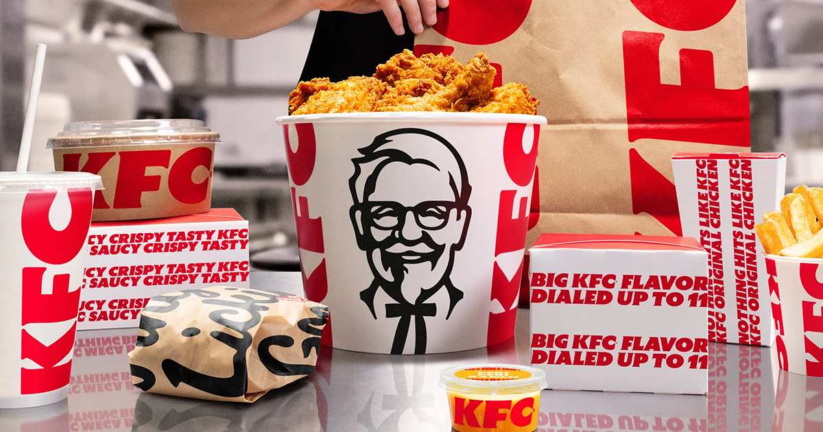
Between January and May 2026, KFC visits in the United States fell 1.9% year over year. In the same period, direct competitors Chick-fil-A and Raising Cane's grew 3.1% in traffic. For the quarter, KFC's global revenue still rose 6% in constant currency, but the American market, the most competitive one, dropped 2%.
On June 16, 2026, KFC announced the biggest rebranding in its history. New logo, redesigned bucket, reworked menu, more than 34,000 restaurants receiving the updated identity throughout the year. In Brazil, the change starts in August.
The order of events matters. The rebranding didn't come from a moment of strength. It came after months of losing ground to competitors who also sell fried chicken.
What actually changed in the logo
KFC's typography dropped the classic italic slant and gained fuller letters, rounded corners, with the "C" getting much more proportional emphasis. The bucket icon changed too: now the logo appears in negative space, cut out inside the container itself, a technique similar to what Coca-Cola has used for decades on the contour bottle.
It's not a coincidence of style. It's a deliberate borrowing of a visual device associated with the world's most valuable brand in recall. When a brand uses the same visual grammar as another that already has established trust, it tries to import part of that trust into its own symbol before the consumer even forms a new opinion. It's perception by association, and it's measurable: it's the same reason new banks use blue and healthcare institutions use rounded shapes, the brain categorizes faster than it decides.
The decision nobody notices but is the most strategic
The practical reason behind the fuller letters and the enlarged "C" is less about nostalgia and more about where the brand is seen today. Most fast food ordering in the world now happens through an app icon, a self-service kiosk screen, and a delivery banner, small surfaces where thin, italic strokes lose legibility. A logo designed for a highway sign in the 1950s doesn't work the same way in a 40-pixel icon. The choice to thicken the stroke is a response to where the purchase decision actually happens now, not an aesthetic whim.
Why KFC avoided the Cracker Barrel path
KFC describes the process as rooted in the same spirit it always had, and the comparison the trade press makes is direct: the move looks more like the recent refreshes of brands such as Domino's and Sprite, a shape update without breaking recognition, than like cases such as Jaguar and Cracker Barrel, which suffered strong public backlash after changing their identity too much at once.
That's the calculated bet: move enough to look current on small screens and a new menu, without moving so much that the returning customer feels they lost the brand they knew. Rebranding is also perception risk management, not just an aesthetic update.
What this leaves for those who aren't a global chain
The real data point here isn't the logo, it's the timing. A brand losing 1.9% of traffic to a competitor growing 3.1% in the same market is losing relevance in the mind of whoever decides where to eat, and that usually shows up in perception first, before it shows up fully in the register. The rebranding is the visible response to a problem that had already been invisible for months.
It's the same reading FAMOSO.® makes in a brand diagnosis: when sales numbers drop, the instinct is to touch price or media spend. But if the drop comes from stagnant perception, letterforms and shapes that don't keep up with where and how the customer decides today, no discount fixes it, because the price was never the problem.
KFC had the data before it acted. Most brands only notice the drop in relevance once it has already become a drop in revenue.
Perguntas frequentes
Why did KFC change its logo in 2026?
The rebranding was announced on June 16, 2026, after a period in which visits to American stores fell 1.9% while competitors like Chick-fil-A and Raising Cane's grew 3.1% in traffic.
What changed visually in the KFC brand?
The typography became fuller and more rounded, with the "C" getting more emphasis, and the bucket now uses the logo in negative space, a technique similar to Coca-Cola's contour bottle.
When does KFC's rebranding reach Brazil?
Starting in August 2026, after rolling out first in the UK and Ireland and expanding to Australia and the United States throughout the year.
Does KFC's rebranding risk repeating Cracker Barrel's mistake?
The trade press points to the opposite: the move is described as a controlled update, closer to refreshes by Domino's and Sprite than to drastic changes like Jaguar's and Cracker Barrel's, which triggered strong public backlash.
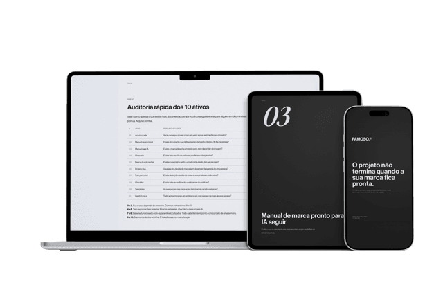
Material gratuito
E se a pessoa que criou sua marca sumisse amanhã?
Os 10 ativos que garantem que sua marca continue consistente, com ou sem quem a desenvolveu.
Ferramenta gratuita
Diagnóstico de marca
Responda o scorecard e receba o score da sua marca com uma leitura direta do resultado.
Fazer diagnóstico →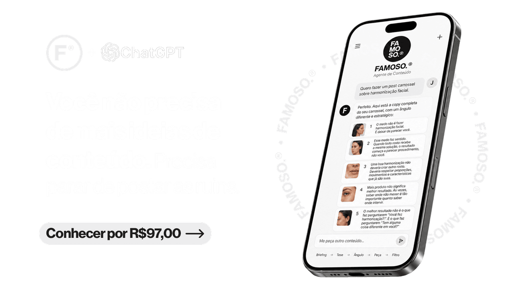
R$97
Agente FAMOSO.®
O processo que uso pra criar posts com tese, não conteúdo genérico. Acesso permanente.
Conhecer o agente →Leia também
- Rebranding or redesign: which one do you needRebranding and redesign aren't the same thing, and choosing wrong is costly. Understand the difference and discover which one your business really needs.
- How to know if your brand needs rebranding7 concrete signs that your brand is limiting your business growth, and when rebranding won't fix it and is money wasted.
- Brand redesign: when it's worth itBrand redesign isn't about liking your logo more. It's about correcting what your perception is communicating wrong.
- Is Fiat Brazilian? The answer and what it hidesFiat is Italian and foreign-controlled. It still leads Brazilian car sales five years running and reads as local. The reason is not price.
Escrito por Pedro Cardoso, fundador do FAMOSO.®, estúdio de branding em Porto Alegre.
← Ver todos os artigosDiagnóstico FAMOSO.®
Você não vende o que faz. Vende o que parece que faz.
Análise completa da sua marca mais uma call de 30 minutos. O valor vira crédito integral no projeto.
CONHECER O DIAGNÓSTICO