
What clean and modern means and why it erases you
Clean and modern is the most repeated brief there is, and the reason whole industries look like the same company. What it means and what to say instead.
Neste artigo
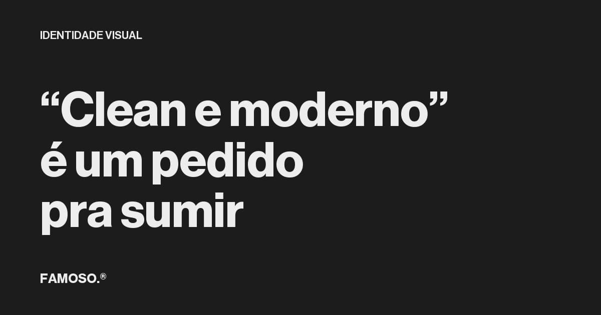
Every week someone writes the same sentence to someone in my line of work: I want something clean and modern. It is probably the most repeated instruction in the business.
And it is a request to disappear.
What the phrase actually means
Clean means without too many elements. Modern means similar to what is being made right now. Put the two together and the literal request is: remove whatever draws attention and make me look like what already exists.
Nobody wants that once they explain further. What the person usually means is I do not want to look amateur, what I have today is confusing, my competitor looks bigger than me. Those are three different problems with three different solutions, and none of them is clean.
The collective result of that request
Between 2015 and 2019 an enormous number of large brands converged on the same place: sans serif, geometric, medium weight, with no distinguishing trait. Google did it in 2015. Burberry did it in 2018, trading typography with nearly a century of use for a sans serif. Dozens followed.
Each of those decisions had a reasonable justification in isolation: legibility on small screens, adaptation to apps, simplification of the system. The combined effect was an entire sector of brands that nobody can tell apart once you cover the name.
The same thing happened at a smaller scale in sector after sector. I have written about that phenomenon in why every AI startup has the same logo, and the mechanism is always the same: each company asks to look current, and current is defined by what competitors just did.
Why this costs money
A brand nobody can distinguish loses on both ends.
Material gratuito
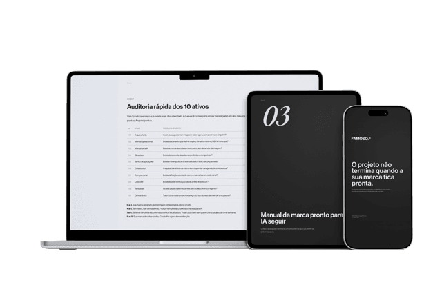
E se a pessoa que criou sua marca sumisse amanhã?
Os 10 ativos que garantem que sua marca continue consistente, com ou sem quem a desenvolveu.
On attention: if your ad looks like your competitor's, half of your media spend turns into recall for them. You are paying to reinforce the category, not your company.
On price: when two options look equivalent, the customer resolves the doubt with the only visible criterion, which is the price tag. Visual similarity invites price comparison, and price comparison is where margin dies.
That is why the instruction I want to look premium and clean tends to contradict itself. Premium depends on being recognizable and specific. Clean, the way the request is usually made, delivers the opposite.
What to say instead
A good brief does not describe style, it describes the work to be done. Replace clean and modern with answers to this:
- →Against whom. Name three real competitors and say where you need to look different from them, not better than them.
- →Where it will appear. Storefront, packaging, uniform, feed ad, PDF proposal, truck. The place with the most exposure drives the system.
- →What it cannot look like. Constraints are more useful than references. It cannot look like a clinic, it cannot look cheap, it cannot look like a startup.
- →What price you want to charge. If the brand has to support a price 40% above the category average, that changes everything, and it is the information almost nobody provides.
- →What has to stay recognizable. If your customer already identifies you by something, that goes in as a constraint, not as disposable material.
None of those sentences describes how the thing should look. All of them describe what it has to solve. Defining the problem is the job of whoever hires. Defining the form is the job of whoever executes.
When clean is the right answer
It happens. A cluttered brand, with seven elements fighting each other, applied ten different ways, does need subtraction. But then clean is the conclusion of the diagnosis, not the opening request.
The difference between those two things decides the outcome of the whole project. Whoever arrives asking for a style gets a style. Whoever arrives describing the problem has a chance of getting a solution, and a solution is what changes the price the market accepts.
Perguntas frequentes
What is wrong with asking for a clean and modern brand?
Clean means removing what draws attention and modern means looking like what is already being made. Together they produce a brand that cannot be distinguished from competitors.
Is minimalism always bad?
No. Subtraction is the right answer for cluttered, badly applied brands. The mistake is starting from the style instead of arriving at it through diagnosis.
What should go into a visual identity brief?
Who you need to differ from, where the brand will appear, what it cannot look like, what price it has to support, and what is already recognizable and should be preserved.
Why do lookalike brands drive prices down?
Because when two options look equivalent, the customer decides by the only visible criterion, which is price. Visual similarity pushes the category toward comparison by price tag.
Material gratuito
E se a pessoa que criou sua marca sumisse amanhã?
Os 10 ativos que garantem que sua marca continue consistente, com ou sem quem a desenvolveu.
Ferramenta gratuita
Diagnóstico de marca
Responda o scorecard e receba o score da sua marca com uma leitura direta do resultado.
Fazer diagnóstico →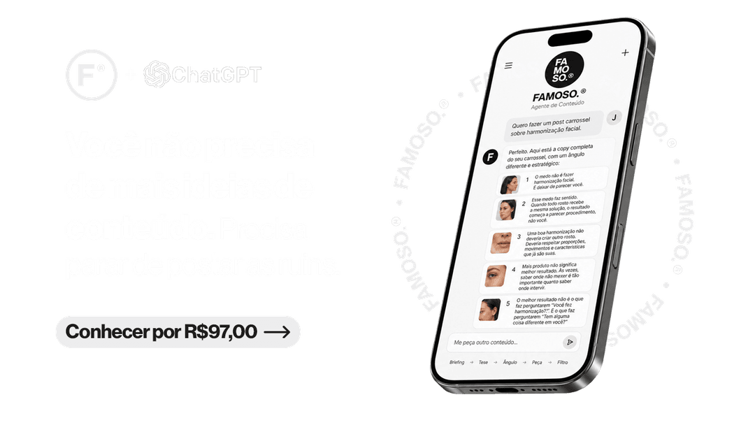
R$97
Agente FAMOSO.®
O processo que uso pra criar posts com tese, não conteúdo genérico. Acesso permanente.
Conhecer o agente →Leia também
- Why every AI startup has the same logoGradient, spark, lowercase wordmark, blue-purple. Open ten artificial intelligence brands and you'll see almost the same design. Looking alike has a cost.
- What is visual identity, really?Visual identity is what makes your brand perceived a specific way before a word is said. Most companies treat it as just the logo.
- Why Your Brand Looks Amateur (and How to Fix It)Does your brand look amateur even though your business is serious? See the signs that make a brand look smaller than it is and what changes in perception.
- What a visual identity manual actually doesA visual identity manual isn't a file to store. It's the document that ensures your brand remains the same wherever it appears.
Escrito por Pedro Cardoso, fundador do FAMOSO.®, estúdio de branding em Porto Alegre.
← Ver todos os artigosDiagnóstico FAMOSO.®
Você não vende o que faz. Vende o que parece que faz.
Análise completa da sua marca mais uma call de 30 minutos. O valor vira crédito integral no projeto.
CONHECER O DIAGNÓSTICO